


In a New York Minuit
The turkey always leads off the parade

No. I didn’t spell that wrong. You’ll see.
Oh. And this will be waay too long for email. Not even close.
So I’ve been needing to sit down and sort of document a toy I’ve been playing with to help me make less sense of pandemical things. At this point only about maybe …5 years late.
A pretty good way to understand how something works is to build a model of what might be happening and look at how well it fits observations. When we are somewhat confident that model has something useful to say, we even could try and use it to make a prediction toward a future event. We could then use how well it predicts what happened to evaluate whether the model speaks to what might be going on under the hood.
I have played around with disease outbreak modeling over these past few years1, but didn’t have a way to find the best fit between one of these models and data I might come across. About a year ago, I finally got around to working this out, and assembling a crude set of tools to do this.
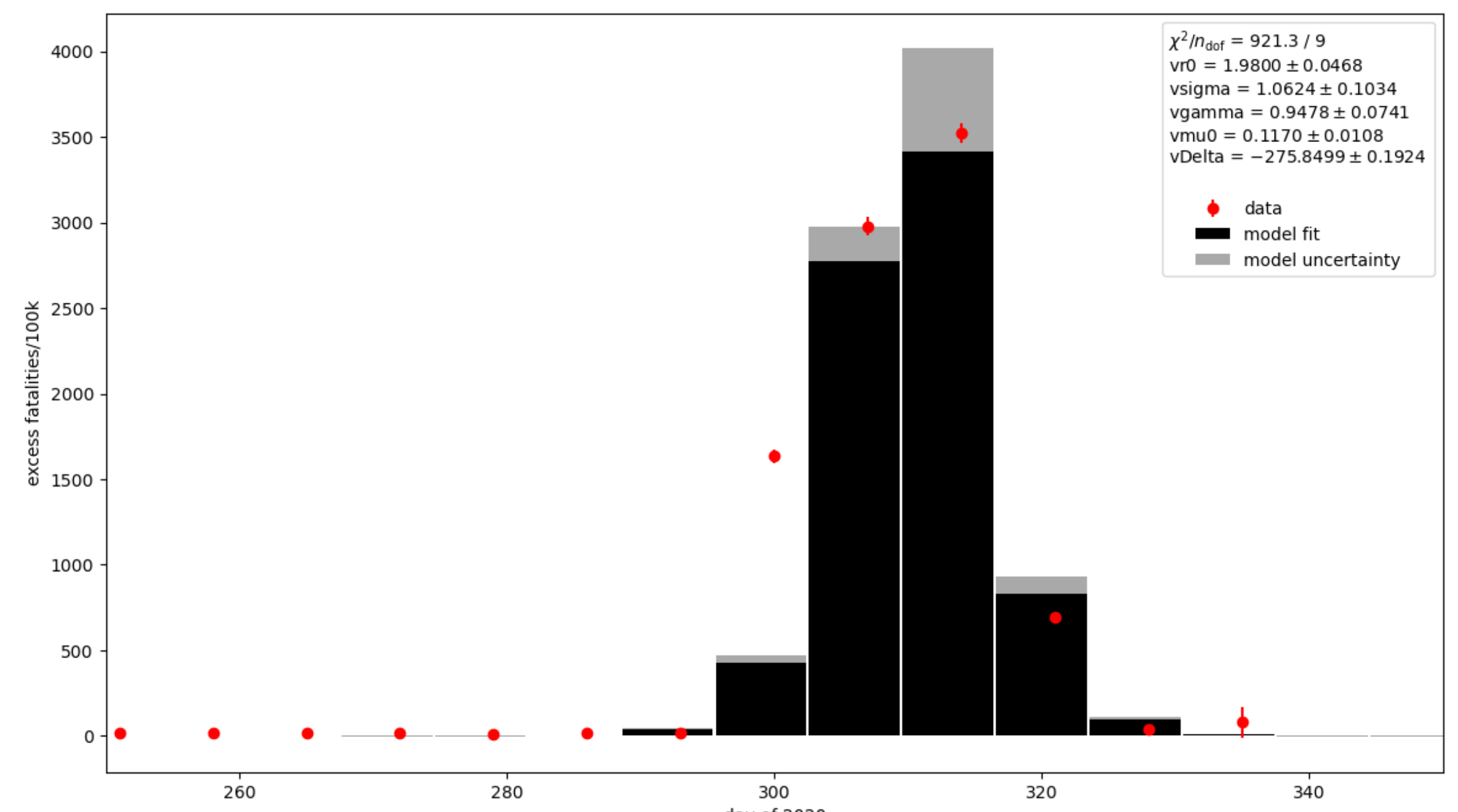
Below is an example of the sort of thing I’m talking about. The red dots in the graph below are some counts of deaths per week, and the black bar chart is the best match of a disease outbreak model to those points. There is an annoying outlier point around day 300, but the model seems to describe the rest of the data2. One could imagine the model behind the black bars mostly explains what happened to generate the distribution of fatalities in the red points, and scratch your head over what went wrong on week 300. Maybe there was a data error there.
But I’m not going to tell you where those red points came from. Yet. I have a lot of sometimes technical blathering to get through first. And anyway it was different, more interesting data that got this ball rolling.
The question
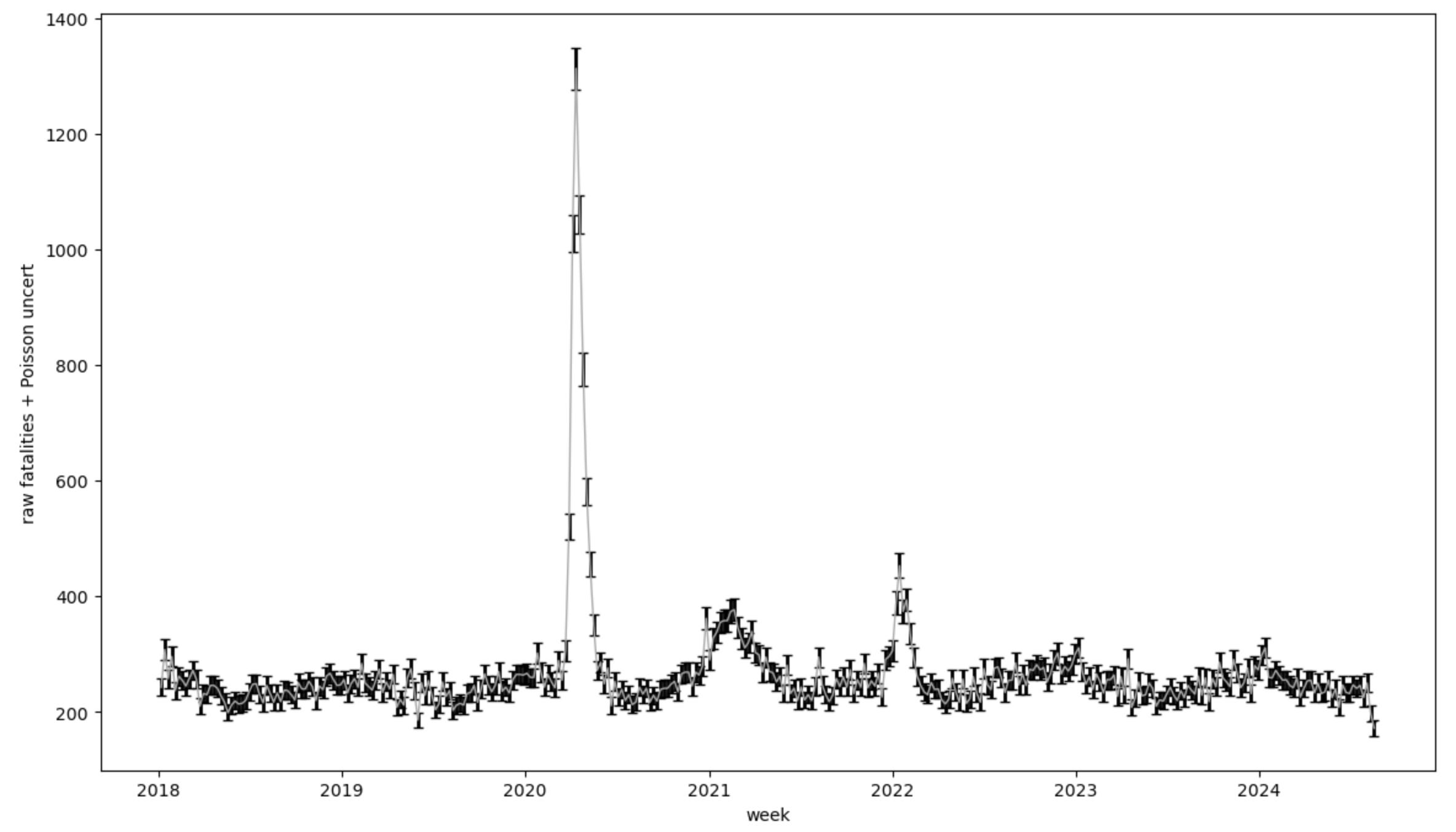
Followers of Dr Jessica Hockett will be very aware that New York has a special place in the world of covid shitfuckery. The timeseries plot of all cause mortality there is very interesting in early 20203:

The above shows just how huge an event that episode apparently was. Normally it looks like roughly 3200 people die each week in New York State for various reasons, with some mild seasonal trends. You can see the pink line holding pretty steady until week 11 (starting March 9) of 2020, when people apparently started dying left and right. In the beginning of April that count peaks around 4x normal, then decays right back down to normal in a few more weeks. What would have been normal in 2020, estimated from past years, is shown by the slightly broader fuzzy line under the peak and extending to the left and right of it.
My first inclination after seeing this plot a couple years ago, was it looked very much like a smeared delta function. That means, essentially a sharp underlying spike, blurred by some other widening effect (will see more later). It also is very clean — the event started from a pretty stable baseline, then returned right back down to normal levels only a handful of weeks later. You may have heard somewhere that we’ve been in a deadly pandemic for the last 5 or so years, but if that’s what happened in New York State, it completely ended by June 2020.
I wanted to look at what would happen if I tried to fit an epidemiological model like SEIRS to this. What would the resulting parameters look like, what sort of crazy disease could make that kind of mortality behavior, and then what would that model predict for other places in the US. We’re going to walk through some of that here. And I should definitely note, especially given some of the confusing discrepancies Dr Hockett and her Panda friends have found, that what I do here assumes the CDC Wonder mortality data accurately reflects the correct timing, quantity and location of the recorded fatalities. Model conclusions I’ll end up making are only valid within that context, and perhaps speak to the validity of that assumption. Perhaps this is one of the reasons I’m going through this exercise.
The data
The plot above was from the us mortality website, which is a really nice interactive tool you can use to explore and compare how mortality vs time has looked like between different places worldwide. Sounds like fun doesn’t it? Let’s make plots of dead people! You can for example compare New York in 2020 with other US states and perhaps ask yourself why most places did not seem to have the pandemic New York did. But that’s for a different day — we’re going to look at New York data and what that might mean for a possible spreading disease, were that to have been what happened there.
The us mortality site’s data for the US is sourced at the CDC, and they have a tool you can use to extract this information in all sorts of ways. That tool is called CDC Wonder

You can use this to pull out tables of data delineated in various ways: Lumped together in time by month or week, by US state and county, by age, by ethnicity, by one of apparently only two genders…. For what we’re going to do here though we’ll pull down weekly reported deaths by occurrence county for the state of New York.
An immediate observation one will come to when working with this tool is not only does the CDC not know its ass from its elbow epidemiologically, it can’t seem to manage producing data in a simply machine digestible way for tools from this century. Think data science provided by the DMV. But I suppose to their credit, this is not a feature unique to the CDC.
Here’s what that data looks like after I:
Yank out extraneous text they inexplicably include at the beginning and end of the data file
Remove the word ‘(provisional)’ from rows, predominantly in 2024
Remove entries containing words ‘suppressed’ and ‘Not Available”.
One of the things they do here — to I suppose preserve the anonymity of dead people, is not show data from a week in a county if there were less than 9 fatalities there. Instead they put in a text thing saying ‘suppressed’. I could really imagine the embarrassment someone might have if you were to work out they had died in that county that week from these numbers. The main effect of this is that low population counties will have many holes in this data. We’re going to stay away from those counties for now.
Remove ‘Total’ rows to avoid double counting
Parse and convert text like “2018 Week 02 ending January 13, 2018” into an actual machine readable date.
Add in some convenience rows like numerical week and day of the year, and Poisson statistical uncertainties (i.e. standard square root uncertainties) for each of the death counts.

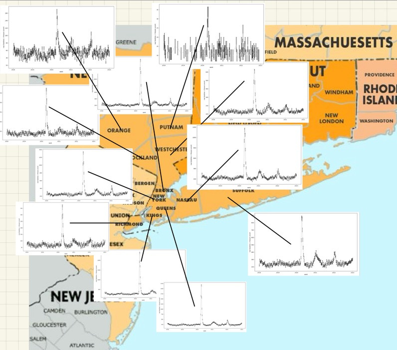
Lotsa nice pretty colors, one for each county (though I think they repeat) there. But you can easily see right away, several New York counties had ‘pandemic’4 events in early 2020. Those are all clustered around the NY Metro area:
And… you’re probably going to look at that and ask things like: What about New Jersey and Connecticut? What about counties further away in New York? Hold on. Focus. For what I want to do in this post, I’m going to just pick one. And since we’re in New York, that is a pretty obvious choice: New York county. Which is Manhattan. And the Manhattan mortality data pulled out by itself looks like this:
Now I’m going to want to do a few more things to further prepare this as a proper meal for our model fits:
Subtract the baseline mortality level to leave only the above normal “excess mortality”
Scale by population to give a mortality/100k, which appears to be some sort of medical world standard. But more practically it allows me to not have to feed in population as a parameter to the fitting tool.
Subtracting the baseline goes like this: I assume the numbers for the years 2018 and 2019 were a normal background. So I average them together and take the standard deviation (which yeah, two points per week…) as an uncertainty. I then for each week following subtract off that averaged baseline number for that week of the year. I’m using 2018 and 2019 as a measurement of what should have happened in the later years, and the difference is then an interesting excess if it reaches much beyond the uncertainties in that process. If I do this the plot then looks like this:
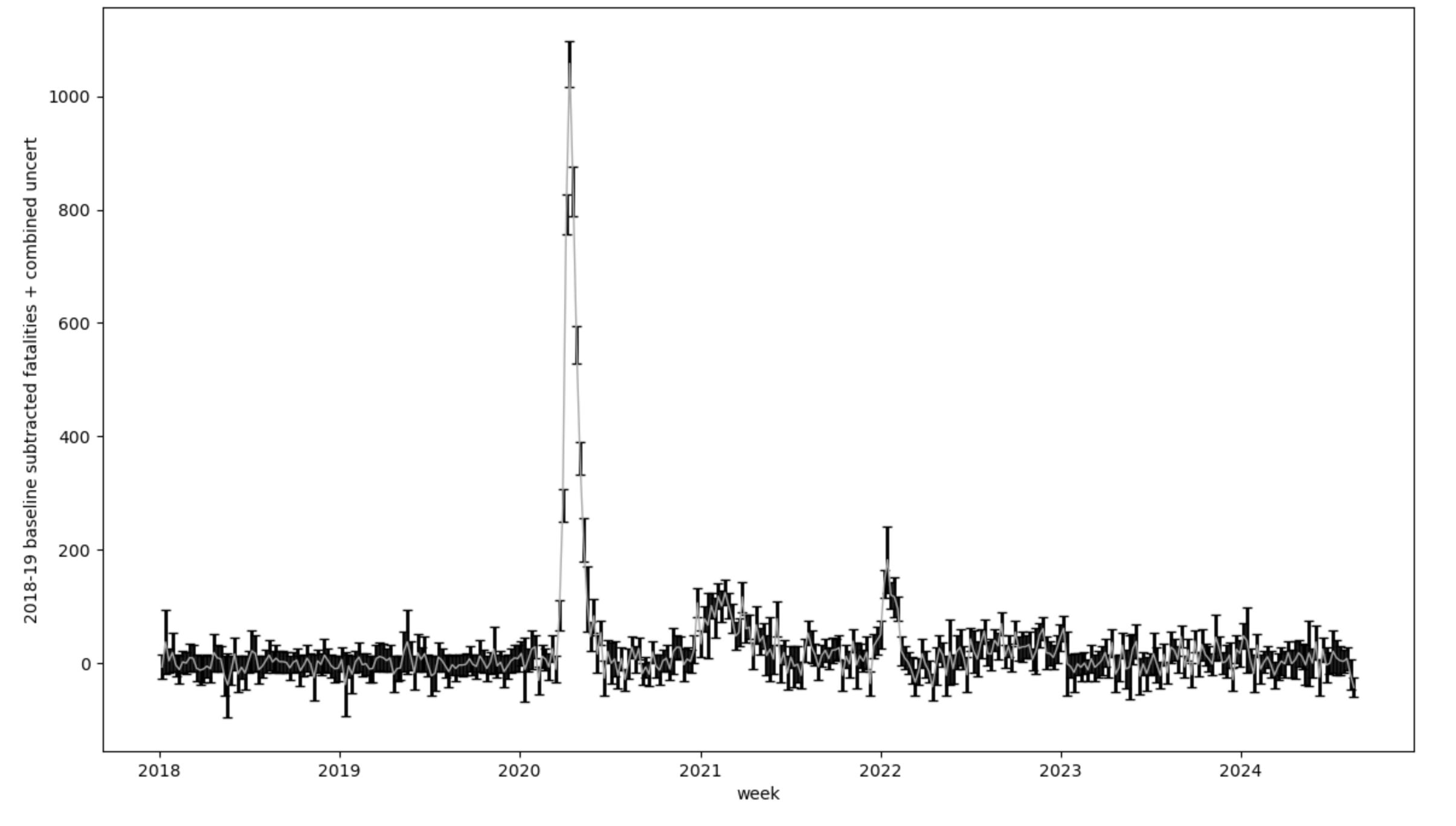
OK — so the plot looks pretty similar, but you should notice right away that 2018-19 is nearly flat. And this is a good test, because that is what my baseline subtraction should do by definition. There is though still some wiggling around there because what I am subtracting is the average of the two years, so if a week is high or low with respect to the average it will land above or below zero in this plot. A keen eye will also notice the error bar grows especially in some of the points. These will be where 2018 and 2019 differed from each other quite a bit, so the uncertainty when I subtract it will reflect that. I could pull in more data to refine my baseline (for example Ben at usmortality does this). There is mortality data going back many more years in CDC Wonder in other datasets, but using these two years is not so bad. We’re going to roll with it.
Next thing I wanted to do was scale by the population and bring this to a “per 100k” set of numbers. Manhattan in 2020 apparently had 1,694,250 people in it. Divide and multiply by 100k:

Yep. Top point was around 1000, divide and multiply should be around 60-ish… OK good.
We’re almost there. One more thing. I am primarily interested in that spike in early 2020. It looks like some kind of echo pandemics happened in 2021 and 2022, but I also know a lot of other things were going on then, like various poisonous shots and treatment changes. They’re obviously not the same thing — just by looking at them. We’re going to cut out and focus on just the 2020 spike:

And there it is — note also I’ve changed what units I use in the x axis: Rather than a full on date, I’m taking day of 2020. This is because the model code operates day by day, and once we’ve zoomed in here we don’t really care what year it is anymore. And really in a lot of ways its not really mattered what year it was since then.
The model
Alright. Great! We established our dataset, the stuff we’re taking to represent observations, now we get together the model (well one of the models) we’re going to try to use to describe it. Fortunately I don't have to write such a thing. An industrious graduate student, who has hopefully written up a thesis and moved on to become gainfully employed by now, did this and made it publicly available to everyone. It is in fact even a standard python package you can install yourself:

Or pull down code from GitHub, and remove the stupid print line he left in there that’s fantastically annoying when a fitting tool runs it thousands of times repeatedly.
The model here though is called “SEIRS+”; An acronym standing for:
Susceptible — people who are available to be infected by the disease
Exposed — people who have caught it but are not yet spreading it
Infectious — sick people who are actively spreading the disease
Recovered — people who have recovered from it.
Dead people are a kind of ‘recovered’ in this model. Identified as such through a fatality rate, and obviously don’t participate further.
Susceptible (yes again — it covers re-infection, which I’m not using here)
+ for extra bells and whistles, like a parallel population with different epidemiological characteristics due to some intervention, and some ability to manage crosses between that and the rest of the population. Also not using this.
In pictures the model looks like this:

The model constructs a virtual population of people, and lumps them into the green box to start off. Now you can if you want set up that initial box with some percentage susceptible, and some already immune, but as we’re supposedly dealing with a highly novel brand new thing, I’m setting up everyone as susceptible. It also has a fancy network modeling capability that you can cluster your people in different ways to look at how people grouped together in different ways affect the progress of the outbreak. I imagine you could also construct this clustering based on the actual population densities in some place and situation… It is at some level all a matter of how frantically you want to move your hand as you masturbate over this. I expect for example this boy’s hands move like the wings of a hummingbird:

He’s not the one who wrote this code, just to be clear.
Alright — so the model starts with everybody in the green “S” box, and then begins to march through steps of time, moving people into the other boxes to the right based on dice throws against rates you set as parameters. Some of these we will be interested in varying to find the best match to our data (this is by the way what I mean by ‘fitting’):
R0: The famous “R-naught”. This can be thought of as the number of initial susceptible people an infected person spreads the disease to. It has a zero on there because that description only works in the very beginning when everyone is susceptible. Over time, Reffective gets smaller than R0, as more people become immune. Once this becomes 1, your rate of people becoming infected is equal to the number recovering, so you would reach your peak in the outbreak. I believe this is one definition of “herd immunity” — where the derivative in infections flattens out and starts to turn negative. As more people become immune, this Reffective gets smaller, and the number infected at any given time declines. This is why you see the rise, peak and fall behavior. Eventually you completely run out of people to infect, and the outbreak ends. This parameter is a unitless number. Or maybe its in units of people.
σ: Rate of progression. The rate that exposed people become infectious. The model itself uses this and R0 to govern people moving from Susceptible across to Infectious through the “Transmission rate”, or product β, of R0 and σ. σ moves people from the “E” box to the “I” box. Units are 1/day
γ: Rate of recovery. This governs the rate at which people recover and are no longer susceptible to the disease. γ moves people from the “I” box to the “R” box (or dead). Units are 1/day
μI: Rate rate of infection-related mortality. Fraction of recovered people who recovered into another life. This is a unitless number.
ΔT: Offset from day zero (here zero is Jan 1, 2020) when patient zero appears. I assume there is a single patient zero (there are options to start from any number of infected people). Units are in days.
These are the parameters I allow to be varied by the fit optimization tool which searches around to find the best fit to the data. One problem I ran into with the model though is although there is time progression from “S” all the way to “R”, once a “person” reaches that last box, they’re only flagged as such. I really only have time progression through “Infectious”. This is a problem for what I am fitting to however, since that is supposed to be people who not only became infectious, but also progressed through some duration of disease, eventually dying. I need another piece to add to this to be able to compare apples to apples, rather than “sick” to “dead”. I wonder how many people take this seirsplus code out of the box and don’t realize that. It might be fine if you worried about cases. Whatever those may be.
The add-on
I needed a model to describe the progression of whatever disease this is to a recovery or worse. I knew from banging my head on Oregon breakthrough reports several years ago, that at one point they reported a typical “time to death” they observed was around two weeks. Going back though, I failed to find that particular report or study. I did find a few more general papers which seemed to say the same thing, including this one5:

These guys looked at numbers from Wuhan and fit several different kinds of distributions to different disease milestones: Onset, hospitalization, death. Some of the results they came up with were:

Now I have several issues with this paper. I’m not really a fan of using disease data from China. Not that the rest of the world is necessarily better I’ve come to learn, but I at least saw that shitfuckery in SARS1. But OK there they go. I also would have liked to see their fits superimposed on a plot of the data they’re fitting. I don’t have much of an idea how good their model fits. And I mean there’s the whole “what is covid anyway?” question which we’re really just wholesale ignoring today.
Caveats aside, I’m using their distribution labelled (B) in their figure above. This seems to agree with what I remember the Oregon reports saying — a mean of about two weeks from onset to end of life for those who died. So now we have this:
OK — now I have the model for people getting sick. And I have this distribution of the time it takes sick people to die. How do I put them together?
(dueling banjo music)
seirsplus produces a cumulative distribution of people labeled as having died (with timing matching when those people landed in the “I” box) as time progresses. I need the number for each day, so I take the derivative.
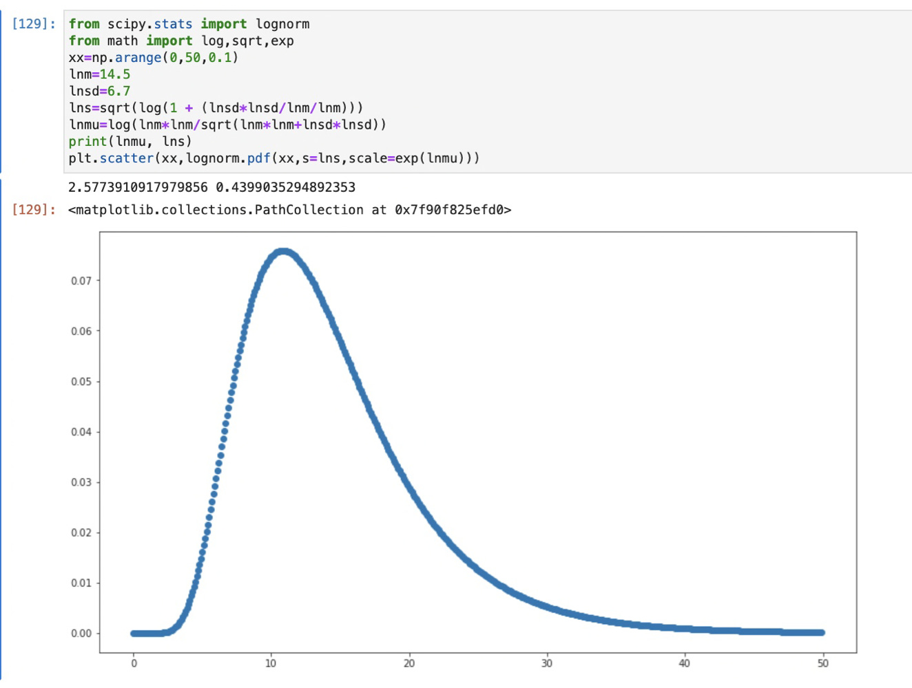
I then have a distribution of infected each day. To turn that into a “when they died” distribution I convolve that with the above lognormal distribution (an example in a sec.)
Then I sum the daily counts back together into weekly bins to match the binning of the weekly data from the county.
Here’s a quick example showing what convolution, or “smearing” does. If I feed convolve this distribution with a single day of data, it redistributes it according to that distribution like this:

This is a plot of a single day long spike in black, then the result of convolving it with the above lognormal distribution. This result shoves the peak about a week later, and broaden’s its width. The convolution does this for each day in the source distribution. This blurs it out, but hopefully the same way varying progression through disease to death does in different people.
By the way — remember way way up there when I said something about a “smeared delta function?” THIS is what that looks like. Look at the shape of that red function and then what my Manhattan data points look like… The shapes look very similar, only the Manhattan data is wider. If this ‘time to death’ curve is an accurate description of that process, something of finite width in time must be happening underneath.
Alright. We have data, we have a model, and have a way of evolving that model data to an endpoint corresponding to the Manhattan mortality data. Now we just need to randomly fish around at parameters and see what works out best right?
You think I’m joking. I’ve seen papers where people actually do that.
We’re not going to do that though. We have better toys.
Throwing fits
The tool I’m using for this has been around for a very long time. It is another publicly available package, this time written by scientists at CERN. It is called MINUIT, or actually in python “iminuit”6. Just like the seirsplus package, you can also go and grab this code to cause all sorts of statistical trouble.
Which is now what we’re going to try to do.
I’ve set this thing up to do a simple least squares fit of my convolved seirsplus model to the Manhattan mortality data. The way this works is you set up a “cost function”, which essentially is a measure of how good the thing you’re fitting agrees with your data. A least squares fit uses the “Chi-square” distribution as a measure of how well the two distributions being compared agree:
The game is to find where Chi squared (Chi2) is as small as possible. The sum making it is performed across all the weekly data points. If the model matched exactly with the data, the squared difference on the top of the fraction will be zero, and the resulting Chi2 will be zero. Actually getting zero here is incredibly suspicious, as it means somehow you also matched whatever statistical fluctuations happened in the data.
If the data points are vastly different, high or low, the squared differences will add up, and you’re penalized with a high Chi2. Each element in the sum is divided by the uncertainty of the data. You can imagine if that uncertainty is huge, you also will have a low Chi2 no matter what you do. It would be a “poorly constrained problem”. We’ve tried here to be careful tracking the statistical uncertainties in this data. There also could be systematic uncertainties, biases that we’re not dealing with at all. Things like “The first 5 dead people each week always get lost somewhere”, which would lead to a systematic bias error in the measurement. We’re not imagining anything like that here. We just try to propagate the statistical uncertainties in the manipulations we did above.
Alright — so you provide Minuit with an initial guess in parameters, and then it embarks on a search across parameter space to find where the lowest Chi2 may be. You usually want to hand it a reasonable guess, or it can get lost off in unphysical places and never find a good minimum. Often you need to constrain parameters, and I do this generously here (essentially make sure positive things stay positive, and the time offset stays somewhere on the plot). It often calls thousands of times for multiple parameters to reach a stable fit. This means in my case it’s running this whole simulation with different each choice of parameters, thousands of times. This part kinda amazes me, because it’s all happening on my MacBook Pro. A couple decades ago I had to commandeer dozens of computers out from under the professors in the department to do this sort of thing for my thesis. One of these fits here takes all of 10 minutes.
Assuming Minuit reaches a minimum, you want to play around with different initial guesses, to make sure you didn’t force it into a weird place. Getting stuck in a local minimum is a thing. We fortunately didn’t.
So what do we get and does it mean anything?
Well after 1382 calls, Minuit ends up giving me this:

You probably can’t ask for a more perfect fit than this — Chi2/number of degrees of freedom around 1. Fits like a glove. And that’s not OJ’s glove. So what would the parameters it came up with be telling us then?
R0 is 4.9 +/- 0.52. That’s pretty big, but apparently not the worst7. Measles and Chickenpox apparently have an R0 around 12. Influenza sits around 2. Looks like Covid19 is supposed to be anywhere between 2.9 and 9.5 according to Wikipedia. I guess we landed right in that range then.
Sigma, or the rate of progression to infectiousness was around 0.7/day, which flipping becomes about 1.4 days. So that would imply going from infected to symptoms is about a day and a half. That short time and the moderate R0 is what causes the ramp up to be as fast as it is.
Gamma, or the rate of recovery is around 0.12/day. That’s around 8.3 days if you flip it. Now remember since we’re looking at, and fitting to mortality, this actually wouldn’t be a rate of recovery necessarily — we actually have no handle on that. This is for the people who died from the thing, how long it took for them to die from becoming infectious. 8.3 days. It has to be broad enough to give the victim time to infect enough people to support that fast ramp-up. But it’s mostly the tail of the distribution which defines this.
Mu_I (which I named mu_0 wrongly in the code a long time ago) is around 0.03%. That’s about 1 in 3000. That’s pretty high. That’s actually about the same as influenza in the US among over 658. If you believe such things.
DeltaT says the first infected person shows up in Manhattan on day 47-50 of 2020. That is about 3rd week of February. And then that one person becomes… 5, becomes 25, becomes 125 maybe by early March…. Yeah, maybe that number could fit in the error bars on my baseline there. Several hundred die there each week normally. Maybe that fits too.
So this is interesting. The results we got out of this fit sounds very narrative to me. It would have to be a highly infectious thing, it seems to have a pretty high fatality rate to get that many people killed. Maybe we have a patient zero sometime in February. But what else is this saying?
A single person in late February kicked this off. This means any single infected person who left Manhattan, should then kick off a similar outbreak at their destination.
In order for that distribution to reach a peak when it did and come back to zero, every single person in Manhattan was exposed, and by June 2020 immune.
We’ll play with these last two ideas in a later post, though maybe my “Lions and Tigers and Pandemics Oh My!” post hints why this might be a problem.
But there’s another thing I can do. All this was under the assumption that this was due to a spreadable fatal “pandemic even though pandemic doesn’t necessarily mean that” disease. Can we fit it with something else? Does that necessarily prove a disease made that data?
Try a different kind of model
Lets be evil for a sec.
Let’s say that some terrible supervillain pulled a magic switch that made a bunch of people sick, and then many died along some progression like my lognormal “time to death” distribution above. This could be some kind of poison or subway gas attack, or even synchronized weirdos in masks jumping around corners at people giving them heart attacks. It could be as simple as a treatment change.
But let’s say on a certain day a switch is pulled, the bad stuff happened, then the switch was turned off again. This behavior is described by a step function. On at a certain time, stays on for some width, off after. Binary.
I’m going to take that step function and convolve it again with the lognormal distribution, but this time, I’m going to include those parameters in the fit. Which means I have for fit parameters:
T0: The day the evil switch is turned on (units of days)
W: The width, number of days that switch is left on (units of days)
H: The height of the step function, how many people/100k are “painted for death”. The number that action eventually causes to die per day while the evil switch is on. (units… I guess people)
ttdeathmean: Mean of the fitted “time to death” distribution. (days)
ttdeafhsigma: Width of the fitted “time to death” distribution. (days)
In fact you saw a 1 day version of this above with my convolution illustration plot.
OK.
I now have a model of a completely nefarious alternative to the pandemic theory. Does that fit the data at all?
Well:

It does.
And it fits essentially statistically indistinguishably9 from the pandemic fit above. If it is slightly worse, it is because I probably am too idealistic in my belief that all of Manhattan will lockstep follow orders, and that there isn’t some ramp up and down as people decide to act on orders (actually I’ve tried this, and a sloped ramp does make it completely indistinguishable from the pandemic model).
You’ll also see a lot of grey here. This is because these parameters are very correlated with each other, especially the step width to the width of the lognormal distribution.
But OK — what do these parameters tell us about the evil which befell Manhattan?
T0 is about day 82 of 2020. That is March 22. So that’d be when somebody turned on the kill switch.
W is about 18 days. They left it on for a little over two weeks. There’s something in the back of my head…. “something something to flatten the curve”? Hmm. Not quite placing it.
Whatever it was it averaged 15.6 people per 100k tagged for death. That’s about 2500 people per week in Manhattan.
The mean of the lognormal is nearly zero. This sort of makes sense, since we could float the start of the kill switch any time we wanted. But I suppose it means whatever it was it mostly killed pretty instantly.
The width of the lognormal is also about 18 days. Interesting that this is not too far off what we assumed in the disease case. I believe this is tied down by the shape of the tail in the data.
So OK. This says whatever happened in Manhattan didn’t have to be a spreading disease necessarily, but could have been some artificial action leading to people’s deaths. That the lognormal landed on zero I think says whatever it was could have taken people out right away. Maybe it was Manhattan doctors choosing to do silly dances those couple weeks rather than treat people arriving in the emergency room?
OK on that dark note, we should turn to the fit that I included in the very beginning.
All that and a turkey dinner
And to remind, because this post just isn’t long enough, we’ll repeat the plot:

So yes, it’s a somewhat crappy fit. Certainly much worse than the Manhattan data above, but it more or less follows the points after day 300. What do the parameters tell us in this case?
R0 is around 2. So that’s pretty low, maybe like influenza.
Both sigma and gamma are around 1/day, which is easy to invert in one’s head. 1 day to progress to infectiousness and another day to “recover”, where like above “recover” really means “die”. That’s a pretty wicked disease if you caught it.
mu, the fatality rate is terribly scary here — 10%! Although given what the data is it’s not really scaled/normalized properly. I’ll say this is a fairly meaningless number in this case.
And then DeltaT is way out at day 275, which to be honest is quite a bit earlier than I’d thought.
Because DeltaT means things kick off October 1.
And Thanksgiving is about a month and a half later.
Because this time I fit to the US Turkey sales numbers10 for November.
Those poor turkeys. Musta been Bird Flu.
Some updates since publishing:
9/9/24: Misplaced Manhattan into Kings county in the text — fixed (thanks to Dr Jessica Hockett for catching that)
9/13/24: Had bug in code which displays the model errors on the fit plots — was only showing the bottom half of the model uncertainty (the grey band). Replaced with correct plots.
I don’t normally retroactively update posts, and usually correct problems in later ones, but since I plan on referring back to this one I’m fixing actual bugs here. Of course if I learn something new that’ll go into another post (more are in the works)… since part of the point of this stack in my mind is that I learn things as I go and in some way try to expose how I’m doing that.
Holy crap — this was over two years ago now. There was some faith that “cases” had meaning then.
The Back of the SEIRs Catalog

I was feeling a bit guilty for just asserting something about case peak spikiness and infectious rates without reference or explanation in the Georgia post earlier this week, so took a pit stop from the virtual roadtrip over to Utah to cook up some plots from some toy simulation models to illustrate what I was talking about…
And you’re going to look in the corner there and say wait — that’s a horrible chi squared. And you’re right, though its all from that one point around day 300.
https://www.mortality.watch/explorer/?c=USA-NY&t=deaths&ct=weekly&e=1&df=2019+W44&dt=2020+W33&bf=1999+W01&sl=0&p=0&v=2
As many happily point out — despite what one may have heard on TV and such, a pandemic is just a name, not necessarily meaning that people die or anything. We’re here using it as a name to label those bumps we see in the plot in early 2020, whatever may have caused them. I could have used “Herbie” but that might have been confusing.
J Clin Med. 2020 Feb; 9(2): 538.
Published online 2020 Feb 17. doi: 10.3390/jcm9020538
https://pypi.org/project/iminuit/.
https://en.wikipedia.org/wiki/Basic_reproduction_number
https://www.statista.com/statistics/1127799/influenza-us-mortality-rate-by-age-group/#:~:text=The%20mortality%20rate%20from%20influenza,around%2026.6%20per%20100%2C000%20population
I almost think that was grammatical
For example, https://www.ams.usda.gov/mnreports/pytturkey.pdf
FYI - Elmhurst Hospital ... I called them a week or so after The Big Expose dropped... and told them my 'son' had badly sprained his ankle and that he needed emergency care.
I was concerned that the hospital was overrun and that I would have to wait hours to be seen ...I was told no it was no overrun - it was operating with normal patient volumes in the emergency ward... I might have to wait 30 minutes .... oh I said but what about that story.... well yes... it was busy for a period last week ... but it's back to normal now.
I also called the hospital a few times asking to speak to the doctor who was providing the tour of the emergency area of the hospital where all the sickies were on respirators... every single time the person I spoke to - after checking the dbase - said ... there is no such doctor by that name in this hospital.
That was so far above my ability to understand but WOW, you're smart. I wish I could understand it. Maybe at the end you could just write one sentence where you make a simple explanation for dummies like I am.