

VAERSy Doats and Dozy Doats
VAERSy Doats and Dozy Doats
And Little Lamzy Divey.

Well OK. Couldn’t think of a good title.
Of late, I’ve been scratching my head a bit over the latest VAERS data1. I had not really looked at where it sat since the end of August, so I pulled down the latest update2 and took a look this week. I’m most immediately worried if there’s something showing up from boosters, or worse, kids. The data now reaches up to November 13. If there’s been trouble for young 5-11 year olds, we might see something here, since thats now roughly two weeks since vaccines were authorized for that age group3.
Simple, if depressing… the most straightforward thing to look up is deaths associated with a COVID19 vaccine. I have 8638 records in this data now due to COVID19 vaccines and that have DIED=”Y”. And first thing we see is a different time structure than the last time we looked4. In August we saw a distribution which peaked in the spring of 2021, then dropped down by July and remained about flat. And that distribution more or less followed the burst of people getting vaccinated in spring, dropping to a slower, more constant rate since5. So how does it look now?
The plot below is a histogram, a plot of the number of entries (vertical axis, which I lazily did not label, is always number of people) with DIED=”Y”, for each day in the past year. What we see now is a double humped structure:

Well there you go. Obviously that second hump is due to boosters, and obviously a lot of people are dying from them right? Well no, not so fast. Let’s see if the data has some indication that that second bump comes from something like people getting a 3rd dose. The data has a variable6 that is supposed to indicate which dose the entry is associated with: “VAX_DOSE_SERIES”. We can look at this plot again, differentiating the data by this variable:

Now we have a color coded version of the same plot. Blue is with “VAX_DOSE_SERIES” = 1, orange is 2, green is 3. There are not many entries with 3, which is a number I’d expect for a booster. But then that is a number I would expect for a 3rd booster after a 2-shot sequence. What if this was people getting Pfizer 2nd shot boosters after their single J&J? We could probably see this by color coding a different way. We can also look at this by vaccine name:
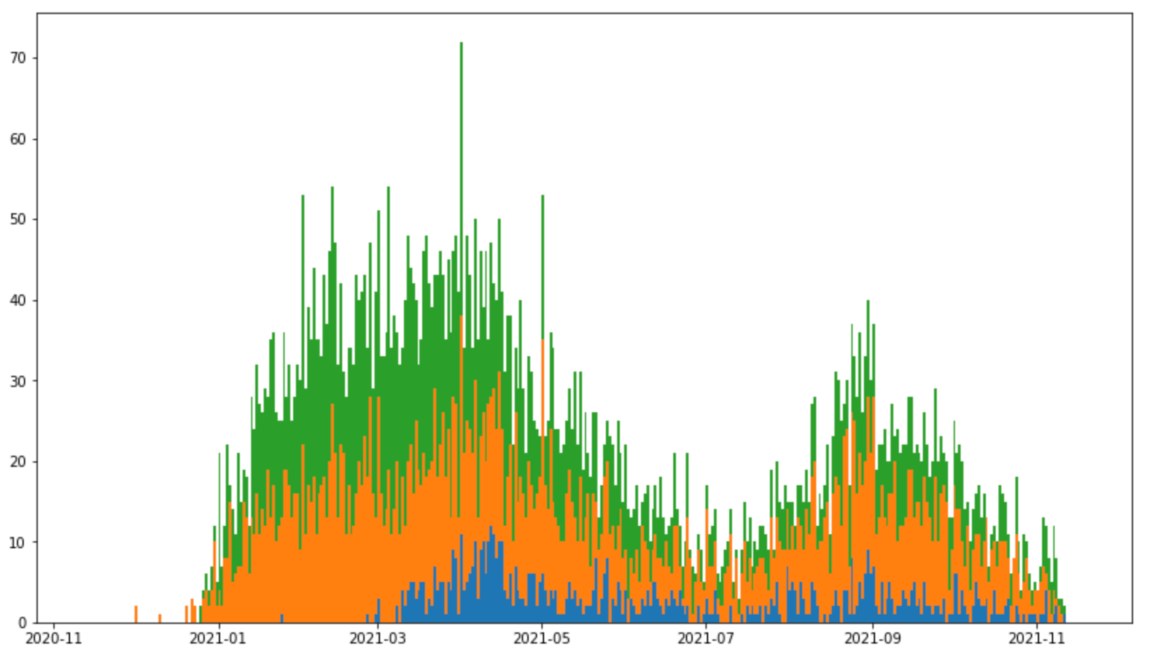
Same lovely colors, different meaning. Here blue is J&J, orange is Pfizer, green is Moderna. So we’re not seeing here the second bump being due to any of the 3 vaccines in particular. In fact they seem pretty evenly distributed. It does not look like I might expect for a round of booster shots. So the scorecard so far:
US VAERS fatality dates distribution now has peaks in March and September.
“September” bump doesn’t seem to be from a 3rd shot
Bump doesn’t seem to be from any of the 3 vaccine types in particular
Something else must be causing the bump in September. A hint likely comes from looking at the time between the person in question died and the vaccination time. This seems it can be many days apart. Below is the distribution of this difference (in days) for all the fatal COVID19 vaccine entries:

There are quite a few here that occur many months after the vaccination date. That does not seem to line up with the vaccine being the cause of death. Although the distribution is stacked towards the low end, there is a long tail extending several months. Many things could have happened during those months that have nothing to do with the vaccine. Perhaps one can gain some understanding of the bump above by looking at some of the entries with the highest time difference more closely.
Dumping the contents of the entries with the time difference > 250 days indeed sheds some light on whats going on. In the free text descriptions of symptoms (SYMPTOM1-5, LAB_DATA, and SYMPTOM_TEXT columns of the database), quite a few of these entries appear to include text like “SARS-COV-2 positive”, “coronavirus positive”, “COVID+”. There are evidently quite a few of these entries that look to have been due to a breakthrough case death long after vaccination rather than a direct vaccine adverse event. Thats a bit of a surprise?
Actually this is apparently legally required for EUA vaccines — from the VAERS FAQ7: (emphasis theirs) “The reporting requirements for COVID-19 vaccines are the same for those authorized under emergency use or fully approved. Healthcare providers who administer COVID-19 vaccines are required by law to report to VAERS the following after vaccination:”, then at the bottom of their list, which of course also includes adverse events from the vaccine: “Cases of COVID-19 that result in hospitalization or death”. So breakthrough cases do need to be going in here?
So I stared a bit at the entries in the “SYMPTOM” columns, and came up with a crude filter that mostly selected entries that looked to be due to a breakthrough infection. There is no clear flag one can key on, and some entries have text stating the patient tested positive, or in others there were “COVID-19” in one of the SYMPTOM columns. It seems to depend on the doctor submitting the record. I can’t say I catch all of them, would say I’m doing about a 80-90% job at this point. So what does the double hump distribution look like now if I try to identify entries that indicate a breakthrough case?

Same plot as above, but now the colors mean something different again. Orange now are those caught by my “COVID+” filter, which looks for combinations of “covid positive”, “breakthrough”, etc. And then blue, which does not pass that filter — presumably related to vaccine adverse effects.
Perhaps now this makes some sense. Most of the entries in VAERS up to around August were from vaccine adverse events, then once the Delta variant began hitting in late summer-fall, breakthrough entries start dominating the fatalities entered into VAERS. The blue part of the distribution also tracks the vaccination rate, which was much higher in the spring, and has come down to a lower, near constant, rate since summer. What does our “time since vaccination” plot look like color coded like this?
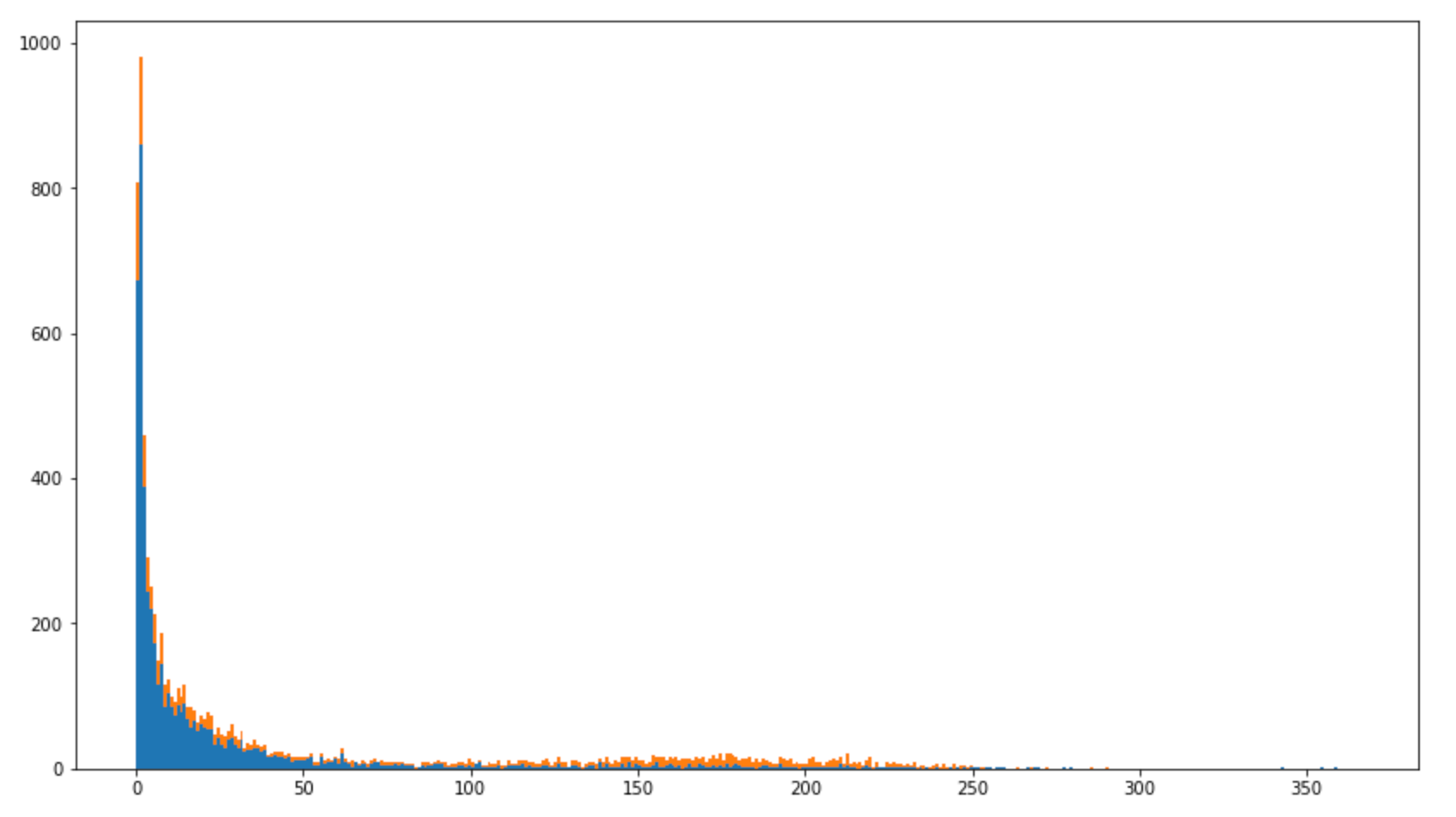
OK — probably I should have done this as a log plot, but if you squint at the higher time differences in this distribution you can see they are mostly orange — again due to flagged breakthrough cases. OK — time to take stock again. What do we know now?
US VAERS fatality dates distribution now has peaks in March and September.
“September” bump doesn’t seem to be from a 3rd shot
Bump doesn’t seem to be from any of the 3 vaccine types in particular
VAERS is supposed to contain BOTH adverse event data AND breakthrough infection data.
The September bump looks to be mostly due to breakthrough covid infections
What about total numbers? I mentioned at the top that I had 8638 records that indicated a fatality. That was before implementing this filter though. WITH the filter this number divides up into: 5585 due to vaccine adverse effects8, and 3053 due to breakthrough infections. So we learn more things:
The raw numbers quoted in various excited websites9 do seem to include more than adverse events in the United States — often combining “NonDomestic” data10 and then, we’ve now learned, some significant amount of breakthrough infection data.
And then this begs a pretty big question. 3053 is a pretty low number if its supposed to be the total number of covid vaccine breakthrough deaths. For example — the State of Oregon alone so far has reported 513 breakthrough deaths11. Its probably unlikely that 17 percent of the breakthrough events in VAERS were from Oregon, with 1.3% of the US population12. (In fact there are only 7 fatality entries in VAERS from Oregon that are selected by the breakthrough filter, out of 71 total — Which reminds me — I probably need to update past posts on Oregon too13…).
So maybe this says something else. On one hand we’ve just learned that a third of the domestic VAERS death numbers are not apparently due to direct vaccine adverse events, but instead are deaths from breakthrough covid infections. So in that sense maybe this makes the raw numbers look less dire. But then the breakthrough infection numbers beg an important question as well. There’s roughly 3000 (rounding, which is well within my made-up 10-20% uncertainty) breakthrough deaths recorded there. We know from individual states that there appear to have been many more that must not have been recorded in VAERS for some reason. The State of Oregon reported 513 breakthrough deaths. Scaling that up to the US population (329M, census link below) would scale to approximately 40k breakthrough covid deaths in the United States. If only 7.5% (3k/40k) of the breakthrough deaths that were “required by law” to be recorded in the VAERS database actually were, what does that say about the vaccine adverse fatalities? Were there really 13 times more of them as well? Are the caveats one reads about VAERS data reliability true but in the wrong direction?
I also just constructed some scaled up numbers there in a pretty loose, flawed way — would be interesting to now compare these breakthrough numbers with what each state is reporting to see if on can get a better idea of that scale factor. My 40k number is assuming all states are like Oregon, with the same case and reporting biases. One can actually get a different number by observing the 7 reported Oregon (possible) breakthrough deaths in VAERS is 73 times lower than the State reports. Is there a bias in VAERS reporting that leaves counts 10-100 times too low? Maybe looking at this state by state sheds some light on things. At a later day though — substack is screaming at me I’m at a limit for this post…
I started this off, by the way, asking this question in the context of kids getting the vaccine. I can at least report some good news perhaps. To the extent we now have confidence these things are fully reported that is. I can look into this data, and make the plots above by age. Here is the age distribution by year of US fatality entries in this database:

Again, as above, orange is fatalities due to flagged breakthrough infections, blue in principle mostly adverse events. It is very much weighted towards older people. Fortunately there are very few young people in this sample, almost none below age 15. There are 3 entries near zero, one I believe attributed to breastfeeding a vaccinated mother. Two weeks in on emergency approval of vaccines for young children, there are not yet corresponding fatality entries. Let’s hope that holds. OK one last taking of stock here — we think we’ve learned:
US VAERS fatality dates distribution now has peaks in March and September.
“September” bump doesn’t seem to be from a 3rd shot
Bump doesn’t seem to be from any of the 3 vaccine types in particular
VAERS is supposed to contain BOTH adverse event data AND breakthrough infection data.
The September bump looks to be mostly due to breakthrough covid infections
A third of the US fatality entries appear to be covid breakthrough fatality reports
Quoting the sum of all fatality entries in VAERS as “US fatalities due to the covid-19 vaccines” is not correct, as over half of the VAERS data is outside US (10k entries which I don’t look at here), and we now know also includes these deaths due to breakthrough covid infections.
Breakthrough data included in VAERS seems to imply as much as 10 (100?) times more adverse events could be going unreported?
Fatalities are strongly weighted towards older people, so far very little with young children.
And Little Lamzy Divy.
https://vaers.hhs.gov/index.html
https://vaers.hhs.gov/eSubDownload/index.jsp?fn=AllVAERSDataCSVS.zip. I should note that I only look at the dated data. There is another grouping of files titled NONDOMESTIC, which are reports from outside the US. Drugs manufactured in the US but used abroad still should report severe events into the VAERS database, so are separated in this additional set of files. I though am only really interested in the US, so I don’t use it.
https://www.fda.gov/news-events/press-announcements/fda-authorizes-pfizer-biontech-covid-19-vaccine-emergency-use-children-5-through-11-years-age

https://ourworldindata.org/us-states-vaccinations
https://vaers.hhs.gov/docs/VAERSDataUseGuide_en_September2021.pdf
https://vaers.hhs.gov/faq.html
Though there still is some work to do here — beyond the breakthrough numbers, there clearly is some “comorbidity” effect in here, with post vaccine fatalities included still after much time had passed since the vaccine.
https://openvaers.com/
The NonDomestic — outside US — data now exceeds the US numbers. Beware of those that combine the 8k US deaths with the ~10k NonDomestic entries and declare that to be “US Vaccine Fatalities”.
https://www.oregon.gov/oha/covid19/Documents/DataReports/Breakthrough-Case-Report.pdf
https://www.census.gov/quickfacts/OR