

The Good, The Bad, or The Ugly Batch?
The Good, The Bad, or The Ugly Batch?
Whats this about lot numbers?

Dr Robert Malone1 published an eye opening account2 this week, of his own life threatening covid vaccine experience. Not that it is unusual that his posts are eye opening. In fact usually the eye lids open wide up and stretch back all the way around to the backside of the head. But the story very much explained to me at least, the “why are you doing this” question, as well as shed some light on an aspect of the adverse events that I hadn’t thought of. Not that that is unusual either.
The aspect about covid vaccine adverse events he describes, is that there appear to be strong correlations between the adverse events and the “lot number” recorded for many of them in the VAERS3 data. He references the “How Bad is My Batch”4 effort, which aggregates this information from VAERS and provides an interface people can use to go look up the lot number of the vaccine they have had injected into them. If you had the thing, there’s the “Holy Crap — look what almost took me out!” revelation there. If you haven’t, it certainly validates why you haven’t.
I wonder if there is a mobile app opportunity here.
I would expect if nothing else it sets an app banning speed record.
There are vaccine lot numbers in VAERS that appear much more frequently than others. This implies there must be “bad batches” that are worse than others. If you start to read through the documentation on the “How Bad is My Batch” page, you see a lot of digging and detective work. Trying to for example, fit lines to plots to try to understand what should be publicly known answers to fundamental questions, like “how big is a batch anyway?” I am, as are unfortunately all taxpayers, paying to distribute these and cause all this damage. Why can’t we know some basic details of what we’re being compelled to pay for in this?
I do not have these details, but one thing I do have, is a copy of the VAERS data. So I figured I’d poke at it, roll it around, slosh it in the glass a bit and see what bubbles up. I should say, like I’ve said before, most of what I do here is nothing if not half-assed. Beware. That said, I personally put more stock in what I dig out myself than I find dispensed by Government Medicine these days. They are clearly waxing gibbous if not full.
A small buzz in the back of my head thats bugging me too (not my eyelids — rolled them back) is are the bad batches “bad” or are they the “good” ones? Are they causing problems because they’re broken, more defective than others in some way, or are they causing problems because they’re the ones actually doing what they’re “supposed” to be doing somehow?
I think I might have a way to try some kind of check, since I think I can identify the data in VAERS that has to do with a breakthrough covid case or not. If the “bad batch” guys are really the “good batch”, I might expect to see them appear less in the breakthrough sample. There’s some fiddling to do first before we get there though.
Alright — I pulled down the latest release of the VAERS data, which now includes the entire year of 2021. Last day is Jan 1, 2022, so this is actually a good full year sample to work with. Some rudimentary numbers as we wade in:
I have 701972 entries with “VAX_TYPE” == “COVID19”
Of those 9743 have “DIED” == “Y”
Of those 6072 did not pass my simple covid breakthrough filter, implying they are mostly the adverse fatality entries.
After a brief discussion and fevered calculation, my 2nd grader informs me this implies 3671 of those entries are likely vaccine breakthrough entries5.
OK. Now let’s look at these batch numbers. These are in under the “VAX_LOT” field in the data. I’m going to for now stick with the fatalities, as a smaller working sample. Now approaching 10k is not in any shape or form small though.
Within the full 9743, I have:
2777 with nothing — a blank for VAX_LOT.
Another 450 with variations of “Unknown”, “N/A”, …
Leaving 6516 that have valid looking batch numbers.
So those I then group by similar name and sort them. The top 10 look like this:

Those numbers by the way, are number of entries I have associated with each one, that passed the “DIED” == “Y” requirement. So there are in principle at least one of these related to over 100 fatalities. Thats rather staggering. I’m going to want to look at some of these top guys more closely to try to understand what this “VAX_LOT” might really mean. Here though is a distribution of the number of fatalities associated with all 1055 VAX_LOT’s I have.
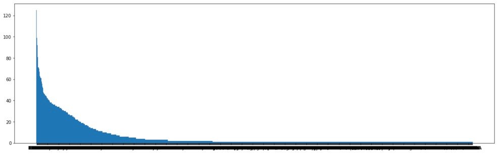
OK — thats a bit of a mess — long tail of VAX_LOT’s with single fatality entries eventually out on the right. Here is zooming into the top 100:

If you squint you can read the batch numbers in the legend now. Well those of you who haven’t had your eyes messed up6 by the shots…
So one thing I would expect, if the VAX_LOT’s correspond to a “batch” of production, is that it might be localized in some way in space or time. At least it seems reasonable in terms of identifying a thing being produced in a facility somewhere. Maybe a batch corresponds to a pallet load of vials shipped to a couple states, or a day’s production or whatever.
So OK — what do I find if I take the #1 guy, EN6201, and look at what VAERS has in the “STATE” field for those?
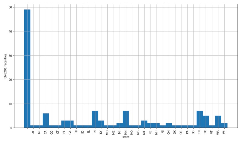
This is the number of entries in that 125 for each state — the large bar on the left corresponds to the entries that did not have the state indicated. The distribution of this one is kind of all over the place though. Let’s remove the “DIED”==“Y” requirement, and get all the VAERS entries for this VAX_LOT for all adverse events, fatal and nonfatal:
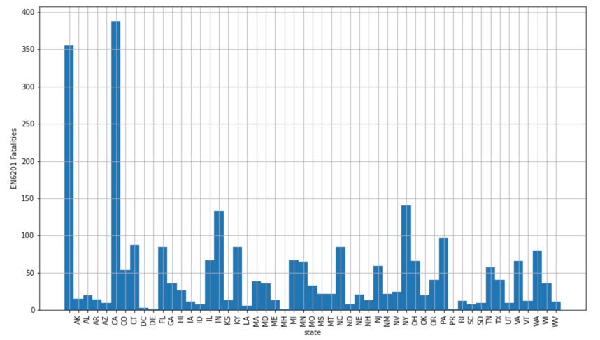
Many more entries (2646 in total), and scattered over all 50 states, including Puerto Rico and the Marshall Islands (Which I learned is MH). Not seeing a spatial correlation here, in fact maybe a loose population correlation. But this says to me that a "VAX_LOT” = “batch” must be huge. A batch that ships out to all 50 states and US territories? And we’re seeing this just by entries in reporting of adverse reactions from that batch? How big are these? One guess:
Assume they are all the same size (a close your eyes and jump the cliff guess. There is no reason I can think of why that would be necessarily, but you have to start somewhere in the absence of any information at all). As of Jan 1, 2022 there were something like 500 million doses applied7. I have 1055 batch numbers that I pull out of VAERS here. Employing the 2nd grader to divide again, that corresponds to about 500k doses per batch, assuming they’re all represented in VAERS and the same size. Guessing 10 doses/vial? 50k vials/batch? I can maybe see that.
OK — batches scattered all over the place…. What about time? Here’s the vaccination time associated with EN6201:
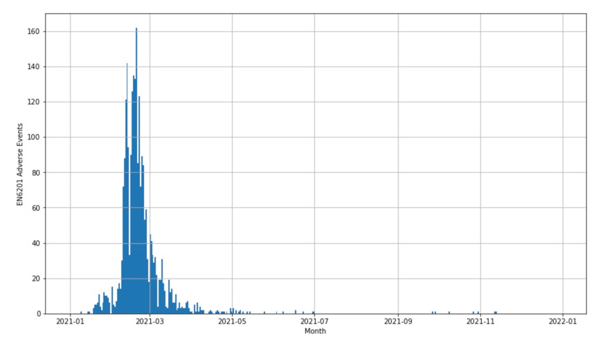
OK. That’s starting to make sense — there does appear to be some time localization. Wondering about those bits out around November though. Don’t know what the lifetime of the vials are, but either those are mistaken entries, they last a long time, or some maybe shouldn’t have been used this late… OK that was one of these. Lets pick up all 10 of the top 10 and see if we see them clustering together.

And I would say they do. Each color there is a different one of the 10 batches. So what do I think I understand now?
Lot numbers are recorded in VAERS
There is a range of “badness” of each of these lot numbers, as measured by their appearance in VAERS
Doses from single lot numbers appear to scatter across all 50 states, including as far as the Marshall Islands
If one GUESSES they are all the same size, there might be around half a million doses per lot number.
Lot numbers do seem to be time localized, so a lot number appears consistent with a production period, and the product then scattered across the country, possibly by population.
What about my question whether it’s really a “bad batch” or a “good batch” in terms of ability to prevent the disease, thats causing the trouble? Here is the comparison of the top 10 most appearing lot numbers (main plot) compared to the full distribution for all ~10k fatalities (inlay), where I try to separate out breakthrough fatalities:

These are counts/week for each day of the year for the reported day of death from all of the top 10 VAX_LOT’s, now differentiated between whether my simple text filter8 identifies them as covid breakthrough (orange), or not (blue). I see a lot of orange in the main plot — in fact no less or more really than one sees in the upper inlay for the entire COVID19 fatality sample. This tells me it’s probably not the case that these batches could have been killing people from being the more “effective” ones. So they’re not the “good” batches. It seems they are, in the sense of effectiveness in preventing breakthrough case death from covid, maybe as much of a "bad" batch as any of the others.
And then note my first plots up above. There’s a pretty gradual slope of rates of appearance of these things in the VAERS fatality reports. Not knowing the size of the lots or batches in the first place, I can, under the veil of ignorance, completely explain that distribution by batches NOT being of the same size. If, for example, there is a 100x variation in the size of the batches9, but they all have more or less equivalent probability of causing someone to land in a VAERS report, you could see a distribution like that. It then would be more of a distribution of batch SIZE rather than badness. Without that data I don’t think we can know.
I’m not seeing a straightforward excuse for adverse effects in manufacturing quality in either direction at least from the VAERS data. But then trying to assess that at the tail end of the things being shipped everywhere in the country, with significant attrition whether something bad happened gets reported, convolved with all the factors that would contribute to the severity of an event over the course of this year…
If only there were an entity… like for example… one who possessed data it might be using to validate whether an individual had inoculation status based, privileged access to travel and basic services. They could pretty easily provide the information, even anonymized information, one could use to disentangle a question like this. But that entity seems absent. Thats anyway antiquated, out of date, ‘1984’ talk. OldSpeak.
So OK. At this point I think then, that the worst troublemakers we found above are not the “Good” batches, they’re not the “Bad” batches, but they’re likely ALL the “Ugly” batches. That someone unfortunately lands in this data sample is probably more a general attribute of the substances that are being introduced into them, rather than any particular production failure of some of it. My take at the moment at least, is the information we find encoded as “VAX_LOT”s in VAERS, is really just another bullet for the gatling gun that should have obliterated this whole “Vaccination as Final Solution” effort long ago.
https://vaers.hhs.gov/
https://www.howbadismybatch.com/
And thus the “COVID Vaccine Injury and Death Story Problems for Children aged 5-11” substack was born. Nnnno… Maybe not. Not going there. Today at least.

https://ourworldindata.org/covid-vaccinations

Oh for chrissakes. Biff just sneezed in that batch too. Stop it and we’ll have to start another. No, no. We’ll keep those though.