

The Back of the SEIRs Catalog
The Back of the SEIRs Catalog
All kinds of toys back there.

I was feeling a bit guilty for just asserting something about case peak spikiness and infectious rates without reference or explanation in the Georgia post earlier this week, so took a pit stop from the virtual roadtrip over to Utah to cook up some plots from some toy simulation models to illustrate what I was talking about…
Namely my mostly unbacked-up assertion was this:
a very highly infectious, high R0 gives you a fast spike up and fast burn-out, while a lesser R0 gives you a slow rolling increase with slow decline. Subjectively, how spiky the outbreak peak is can be a measure of how infectious the bug is.
Us all having been through a pandemic for a couple years now, “R0” might not be an alien term or concept, but I should still explain where this statement is coming from. We’re going to talk a bit about modeling things like viral outbreaks. Which, by the way, I’m not an expert in, beyond having a fair bit of expertise working with computer models of much less biological things.
The science (to the extent “The” should ever be paired with the word “science”) for this kind of thing is called Epidemiology. One of the things epidemiologists do is try to construct models that describe the progression of disease outbreaks. I’m going to use some of these tools in the form of a software package called SEIRS+ (seirsplus)1. The code includes all sorts of outbreak modeling capabilities, including handling a dual population where one group has one set of parameters for how the pathogen interacts, and another with different ones (i.e. to model things like a subset being vaccinated or masked, or coated with blue plasti-dip, etc.) There’s also a capability to handle the interactions between these populations. Lots of interesting things in here that one can get lost in. I’m still having some fun working through some of that getting-lostedness.
But for today I’m really just going to use this as a simple one population model. I want to try to quickly illustrate what I mean when I say a highly infectious bug having a spiky outbreak peak.
So what the modeling code does is progress a disease outbreak in time from initial conditions you provide to it. You start the game off telling the model things like the size of the population, characteristics of the disease, like for example how long infected people are sick and infectious and the scale of how infectious they are. A parameter that controls this scale, is “R0”2. It’s a measure of how many new cases an infected person generates (ideally). In other words if nothing else prevents it, if R0 = 2, it means an infected person contributes to 2 more people getting infected. You can imagine in the ideal case then if left to go wild, 1 goes to 2, goes to 4 goes to 8…. And eventually the universe blows up. BUT then there’s other parameters you feed in here, like for example the number of people in the population altogether. At some point you run out of people to infect. You can also set parameters like how long the disease is infectious, and how long someone who has been infected is immune before being vulnerable again. And you can include things like probability of hospitalization and death.
But I’m not going to that level of complexity just yet. I want to show what different infectiousnesses, different R0’s do so you know I’m not just pulling the above statement out of the orifice I’m sitting on. Not completely anyway.
So I set up this code with a population of a million people, once they’ve been infected they’re immune forever, and nobody gets hospitalized or dies (I’m in a good mood). We started things off with 200 people infected on day 0. 3 Then I varied this R0 — from 0 to 9, and ran the model for 200 days for each case4. Here’s what the number infected over time looks like for each of those:
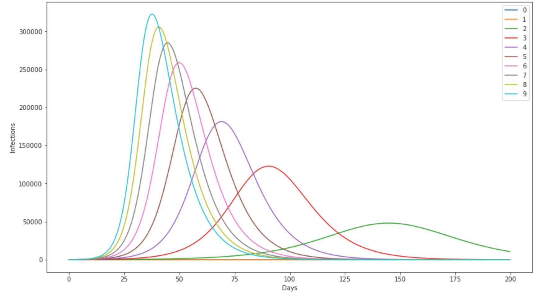
So the legend on the right show’s what color line corresponds to which value of R0. 0 and 1 actually never goes anywhere, like you’d expect (an infected person going on to infect 0 people is a pretty pathetic pandemic. R0 = 1 is sort of like handing a relay baton around — also fairly boring.). Things start getting interesting with R0=2 — thats the green bump off to the right — it takes about 140 days to peak. Then as R0 goes up the peak happens sooner, the peak getting narrower and narrower as the disease gets more infectious. For reference, the original Wuhan strain maybe had a R0 of around 3, 5 Delta is maybe around 7, and omicron possibly as high as 10. 6. BTW superscripts intentionally look strange here, because I didn’t want it to look like I’m saying omicron had an R0 of 1,000,000. That would be some kind of wicked nuclear virus.
But hopefully now you can see why I say the higher R0, the spikier the outbreak — the highest, sharpest peak there is for R0 of 9.
Something else you should see here — for all of these, the number of cases shoot up, reach a peak, then come back down, approaching zero. What is happening is in the beginning you have a rich field of uninfected people, the infections take off unimpeded, but at some point start running into people who already had the infection & don’t go further. So the infection starts off getting R0 people per infected person, but over time it gets harder and harder to find a victim, and that number effectively (Reffective) goes down. Eventually the number of cases flatten out, then starts to decline. At some point an infected person doesn’t have a chance to run into another one thats not been infected yet. Thats where “herd immunity” comes from. If you see on the news7 that we are seeing the covid cases coming down, it means we’re heading towards some kind of herd immunity. And where that happens, is governed by the current mix of immune people, to what extent people are hiding from each other, people washing hands, people wearing masks, people not wearing masks, how sunny it is at that time, what variant they’ve cooked up this time… Any of those things change, you tweak the behavior of the system.
So for fun, and nowhere near rigorously, I cooked up a couple models that subjectively looked like the Georgia case counts — magnitudes different though:
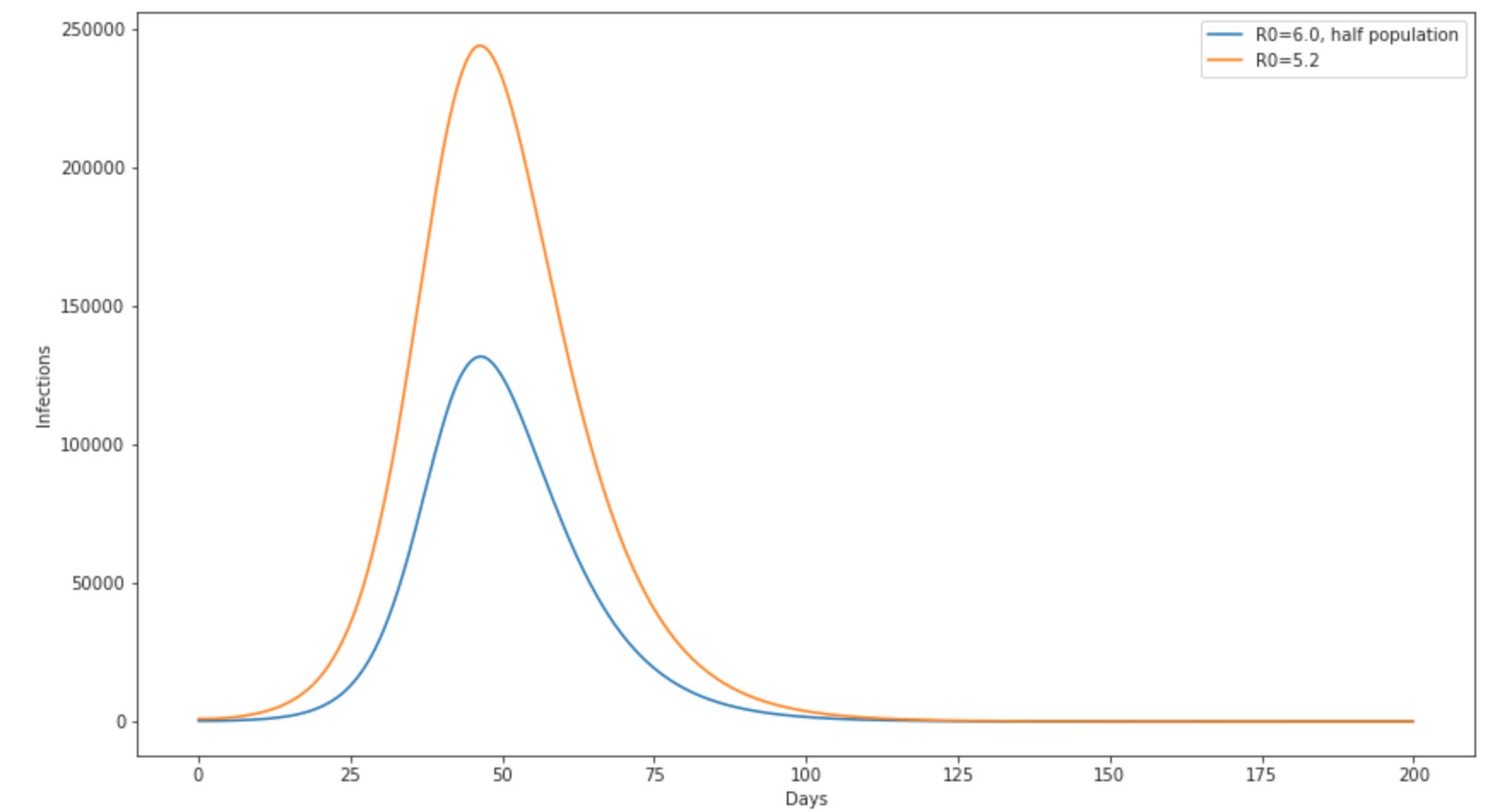
So here I’m pretending the blue looks like vaccinated, orange like unvaccinated. I pretty much arbitrarily set the population for the vaccinated group to half the unvaccinated group. I also did this as two completely different runs, with no interaction between the two. Lots of things that in reality don’t make a lot of sense in this. But it sort of behaves like the Georgia omicron cases appear to have — and I can then calculate and Ev from that:
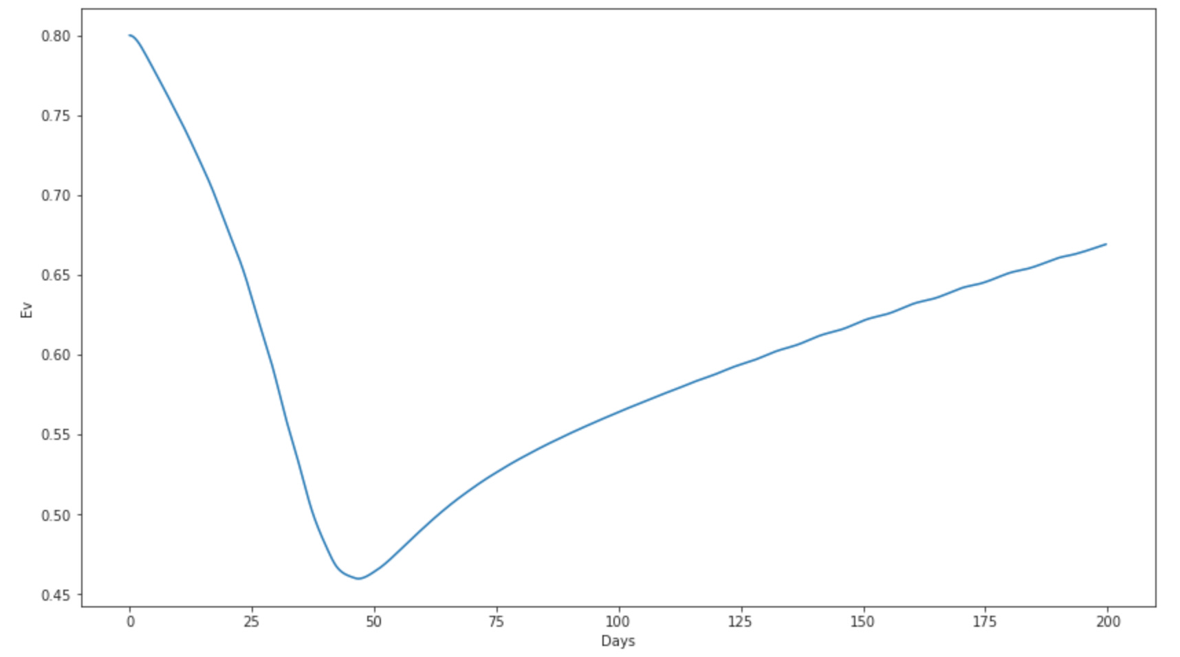
OK so thats cool — can subjectively get a similar Ev behavior over time in a model. Next fun thing here maybe would be constructing a model as a function of a few of these input parameters and playing around with some likelihood fit tools to find the best match to some of the data we now have.
But not today. Gotta get back on the road & truck on over to Utah.
https://github.com/ryansmcgee/seirsplus. Using v1.0, very much looking forward to their 2.0 release…. Really nicely done, includes some example jupyter notebooks, and you can just grab it by doing pip3 seirsplus !
https://en.wikipedia.org/wiki/Basic_reproduction_number
Some evaluation of how long this takes to progress to a detectable outbreak when you start from a single case, and what that might imply in the context of what was observed in early 2020 in the Covid Mother Country is maybe worthwhile at some point…
it wasn’t actually 200 real days, but simulated that many. It actually only took a few seconds. Computers are cool like that.
https://www.ncbi.nlm.nih.gov/pmc/articles/PMC7267092/
https://www.thelancet.com/journals/lanres/article/PIIS2213-2600(21)00559-2/fulltext
You for one thing need your head checked if you’re still ever watching the news anymore