

Boosters Are Peachy!

Note 4/24/22: There is an error in this due to a misunderstanding of how Georgia presented its case data — for now, leaving the below as-is, but please see the update here.
In fact in retrospect, also the latest Oregon post might be relevant here.
OK. We’re continuing our virtual convoy across the US in search of vaccine breakthrough data. And because it’s virtual, we’re not constrained by following actual roads1. We started our zigzag path in Zigzag Oregon, then wandered north to Alaska, and back south to California. We’ve now got the rig parked, as you’d probably predict, in Georgia. So. Lets pull this here suitcase out from under the table and see what we’ve got:
Like a few other states, Georgia has been publishing vaccine breakthrough reports for many weeks.2 Particularly we’re grabbing the latest report3, and again calculating a vaccine efficacy4 over time. Their case data is looking like this:
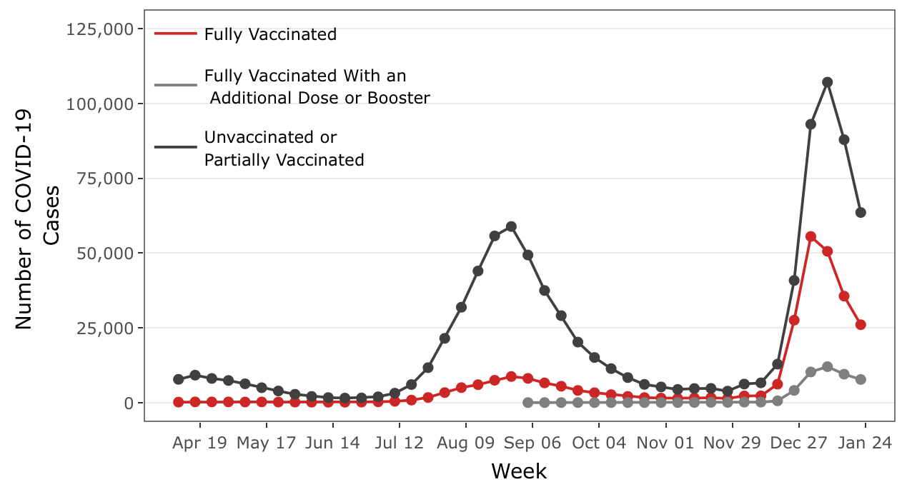
Definitely seeing some excitement here with the new outbreak. In fact what’s more interesting, is they seem to be calling out boosted vs vaccinated people in general. So maybe we can look at booster vs overall vaccinated efficacy. Grey is the lowest of all the curves. Clearly the boosters are working. If you don’t think really at all, (and honestly why should you!) you can probably look at this, shug, and happily roll up to the drive-thru and get yourself another booster. Red and grey is clearly lower.
I will offer this though: I claim that during the entire two years of the pandemic, exactly ZERO people who have been completely coated in blue plasti-dip have tested positive for covid.
OK. Back on path of looking at a vaccine efficacy over time. I don’t see any clear description of what is included or not between the vaccinated/boosted curves, so I’m going to be conservative and assume that the red also includes the grey boosted. Strictly speaking, boosted people are all vaccinated people, so that’s what I’d expect to see from the way they’re described. The “partially vaccinated” piece of the black curve is interesting — but I’m going to for now suppose that is the standard: People who haven’t completed the full complement of doses or haven’t waited the 14 day after waiting period thingy.
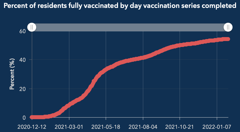
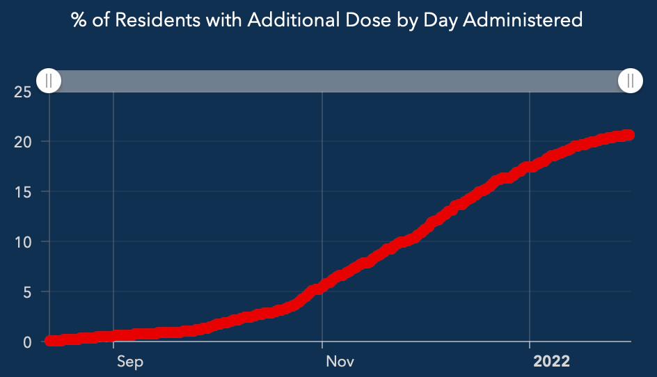
These are also case counts, numbers of people within all of Georgia, so to get an efficacy (and anyway to truly judge whether the counts are significant or not) you need to know what the size of the different populations they came from are. The Georgia pages do have rates/100k plots, but oddly… do not include boosters in that. Probably the page just hasn’t been updated yet. OK — that means to get at this we need to grab that population data too — and that looks like this for Georgia5 (sorry they didn’t have this in a combined plot):
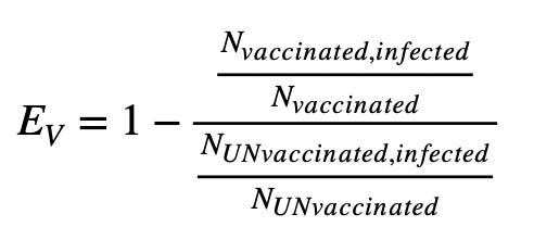
These are percents — which is fine, since I’ll be dividing them (and NUNvaccinated6 = 1-Nvaccinated) on either side of a fraction — I could multiply them each by the population of Georgia, but that ends up cancelling in this:
Here then is a plot of the Ev vs time we calculate for Georgia:

Huh — this looks rather familiar I think. We saw this “Ev bounce” in Oregon too… One thing we have here that we didn’t have in the Oregon data though, is the boosted population separated out to look at.
So I should say what this plot is actually — there are 3 curves. The red is the standard Ev over time, based on the red case curve numbers up at the top of the page, with the denominator coming from the unvaccinated population, the black case count curve. What I’ve added is two more Ev curves though, grey — is the boosted population, also versus the unvaccinated population. So this is giving us an Ev for the fully vaccinated AND boosted population with respect to the unvaccinated. It is higher than the red, which you would expect if the boosters did in fact give you any benefit. But note both drop pretty harshly in December, then begin to come close together. Boosters maybe had some short lived benefit…. Even that though is dipping below 75% here. Herd immunity bound we are not.
Also note the pink dashed curve. This is following an assumption that the red curve includes BOTH unboosted, fully vaccinated and the boosted population in the grey curve. So what I’ve done there is subtracted the boosted case counts from the red curve, and calculated another Ev from that. So that would be in principle an Ev of the fully vaccinated, not yet boosted population. It is also what you would expect in that case, that it’s BELOW the combined curve.
What is strange in these, is the rebound. In fact it is going to be worth going back and looking at the Utah7 data in this light (it is anyway, since we last looked at that months ago). So when we saw this behavior in the Oregon data, we guessed one way this could happen is if somebody, or a coding bug, swapped the unvaccinated and vaccinated case counts at some time. That the number of cases could have become equal, and then later vaccinated cases greater than unvaccinated. But something then swapped them based on a “vaccinated can never be greater than unvaccinated count” rule or ABS(X) or MAX(A,B) kind of function behavior. So we followed that hypothesis, and flipped them back from Christmas on — thats when the low point in the Ev curve was, and where a hypothetical case count cross might have been. I’ll do the same thing here for Georgia, and compare to Oregon:
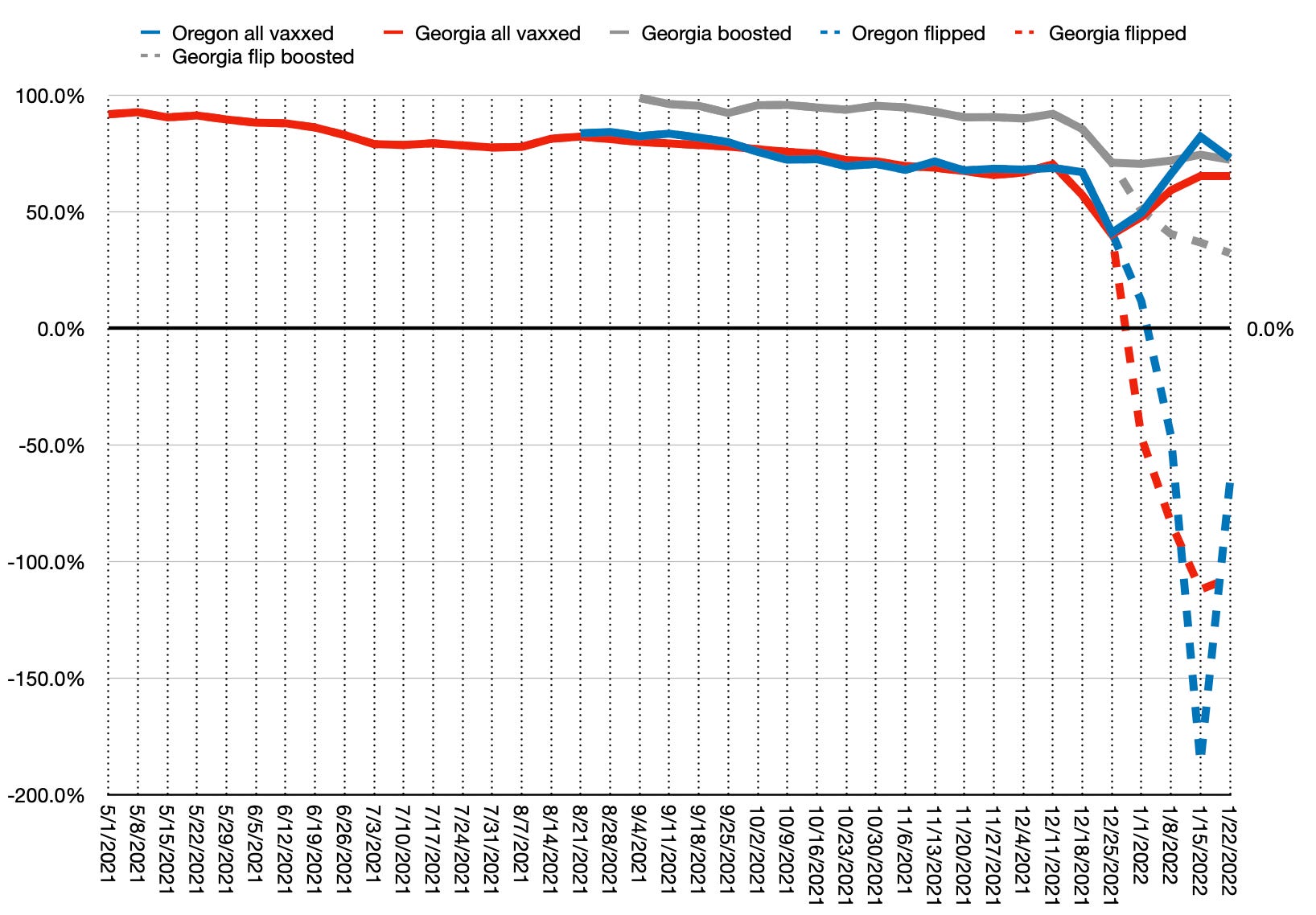
OK — what is this spaghetti? The red and grey solid curves are the same as above, but I’ve added more. The blue curve is the Ev I calculate from Oregon’s data. All of the solid curves are un-messed with. I’m just taking what I’m given from each state and dividing things out. And with that, Oregon and Georgia agree pretty well. They even have their rebounds at the same time and about the same magnitude. On Christmas Day it appears. Santa’s got a bad elf messing with people’s vaccine breakthrough code.
I’ve then added here what happens if I swapped the unvaccinated and vaccinated case counts from that day forward. These are the dashed version for each curve. If this kind of thing happened, then it implies boosters become nearly ineffective, and the vaccinated, unboosted populations in both states are more likely to get infected than unvaccinated. Thats what this going negative means. But again, this is me just guessing and crudely flipping around data. Its not proof of anything — not evidence of misdeeds anywhere. Beyond mine that is.
I’ve been trying to think of other ways we could see this kind of behavior in Ev. One of the possibilities is that cases for vaccinated, unboosted individuals, who were vaccinated early on in the year, people for whom that protection could be said to have “expired”, are quietly being moved into the unvaccinated category. Its sort of a population swap, and its also been hinted at by a language change among vaccine proponents — from “fully vaccinated” to “vaccinations current”. One could imagine this changing, and they haven’t managed to update the description of what they are doing yet. Problem with this hypothesis though is that quantity of people are basically the same as are getting boosted. If you look at say, the vaccinated population in Georgia 6 months ago, you get very close to the current boosted population. So the population you end up moving into the unvaccinated group, the difference between “early vaccinated” and boosted is essentially negligible. You don’t see any difference moving the resulting small number around.
There’s though maybe another way to get something like this, and doesn’t involve any nefarious activity on the part of me or the data providers. I’ve been thinking about the differences we’ve been seeing between omicron and past outbreaks, like delta. That omicron is much more infectious — and we see that even in the plot at the top of the page. The peak happening now is higher than the peak back in August and September due to delta. But its also looking narrower. In fact, the rate that it goes up is definitely much faster than delta was — the black line in December jumps up to the peak in just about 3 weeks, where delta in August took at least 6 weeks. This is a characteristic of how infectious the thing is. You can see this if you model an outbreak (a half written post I’ve had fermenting for a couple months now) — a very highly infectious, high R0 gives you a fast spike up and fast burn-out, while a lesser R0 gives you a slow rolling increase with slow decline. Subjectively, how spiky the outbreak peak is can be a measure of how infectious the bug is8.
So here’s the thing. I’m likely using this Ev quantity in a way that likely isn’t really done — as some kind of tool to see how effective the vaccines are over time. Usually this is used to evaluate how effective a drug or treatment is over a long period of time — over the time integral of what I’ve been doing here. And in doing that you make yourself (more) insensitive to the possibility there could be different short term outbreak dynamics between your two populations. Some of the outbreak dynamics — that we’ve encountered 3 major classes of variants — Original Wuhan-like, Delta, and now Omicron though, is part of what I wanted to see. Whether the vaccines continue to “work” with each of these outbreaks, or if they degrade. I think we have seen they decline in efficacy with each of these outbreaks.
But then most recently with omicron we’re seeing this weird zigzag behavior. What if that is coming about because the outbreak is behaving differently in time between vaccinated and unvaccinated populations. If omicron is, for example, more infectious in one population than the other, the case count peaks could be different widths in those two populations. Why would I guess that? (EDIT: Dr Paul Alexander later posted a very nice medical explanation why vaccinated people could be more infectious)
Here is a cartoon extreme example:
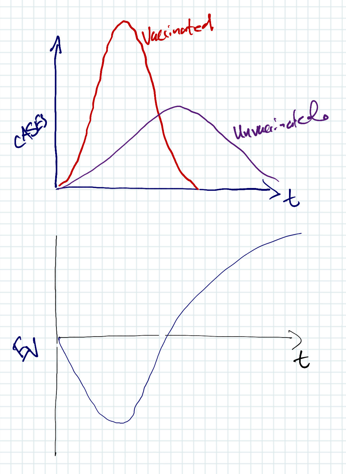
So here I imagine a simplified case where you have something that is more infectious in vaccinated people, than unvaccinated (or depending on interpretation of my handwriting, “unmarinated”) people. If I then calculate an Ev from these (the sketch underneath), I’ll get an initial crash, because the infections are going wild in the vaccinated population, but then you get a recovery once the unvaccinated population “catches up”. So what if this is how we’re getting the bouncy behavior in Georgia and Oregon?
So look again at the plot at the very top. Look carefully at when the black curve peaks and when the red curve peaks. The red curve is indeed peaking a week earlier than the black curve. I would think that implies the vaccinated population is experiencing a “hotter” outbreak than the unvaccinated population. That omicron might actually be more infectious for the vaccinated population. You could then have an initial dive in the efficacy and recovery like we are seeing, and you don’t need anybody doing any funny business with the data necessarily. Part of the recovery also could be the inevitable intermingling or exchanging infections between the two populations, blending them back together. As much as authorities seem to want to make it so, you can’t completely isolate the two populations.
So — where are we then (yes I know, Georgia.)?
Vaccines seem to have degraded in efficacy with delta, and again likely worse in omicron
Boosters seem to have a very short lived efficacy improvement
And only sitting at most at 75% effective with omicron.
We could be seeing that omicron runs hotter in the vaccinated than unvaccinated
Or somebody’s dorking around with the vaccinated/unvaccinated case mix in their breakthrough reports.
Maybe we take a look at Utah next?
Obligatory Back To the Future reference here — should be a youtube link, but doesn’t seem to manifest quite right in the web version always
https://dph.georgia.gov/covid-19-breakthrough-reports
https://breakthroughreports.s3.amazonaws.com/Breakthrough+Report_220126.html, or in case something disappears: https://web.archive.org/web/20220131194159/https://breakthroughreports.s3.amazonaws.com/Breakthrough+Report_220126.html

https://dph.georgia.gov/covid-vaccine, then click on the “interactive dashboard” button. The requisite plots will be on the lower right of the page — you scroll to find either the full vaccinated or “additional dose” plots. You can hover over the points to get the numbers.
Has nothing to do with Nuns, and everything to do with SUBSTACK STILL NOT FIGURING OUT HOW TO MAKE SUBSCRIPTS