

Boosters are Peachy?
Boosters are Peachy?
Georgia on my mind. Again!

After seeing what we saw in Utah1, we’re poking around in other states to see if we see similar behavior. Missouri unfortunately has now dropped out of the race:

This new “phase” evidently does not involve providing breakthrough data to us anymore. In fact the latest data they appear to have is up to February 6, a month earlier than my last pull of their data in March2, meaning they seem to have rolled something back. It appears the wayback machine3 is also not of help here, since it looks like the archived php probably pulls current data (current up to Feb 6) out of the Missouri database to make plots. RIP Missouri breakthrough reporting, we barely knew ye…
Georgia4. They’ve continued to forge ahead however. What are we seeing now there in the wake of the omicron peak5:
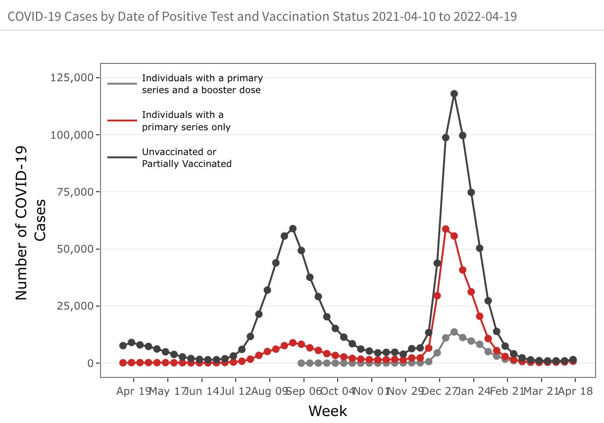
Two bumps — delta in the fall, then omicron. The last few weeks are hard to see (and hover over to pull out numbers) — lets zoom in:

Wait — what’s up here… Am I misunderstanding colors? No… Grey is fully vaccinated with a booster and… Oh this is interesting, red is fully vaccinated but possibly not boosted. This is different than we understood before — And I may have mis-interpreted the data in my first post:

(The caption of the same plot 3 months ago). From this I assumed the red INCLUDED the grey (and in my defense, in the vaccinated population plot in their report, boosted is shown as a subset of the total). Clearly looking at the last few weeks in the case plot, that cannot be however — if the grey is included within the red, the grey certainly can’t go above it. So OK — that means the grey and red are exclusive6. This is the same trick actually, that Utah does when presenting these plots. Draw the boosted and unboosted separately so in their case you don’t see that there actually were more vaccinated cases in all of 2022 than unvaccinated. Here it is not quite that extreme — I’m not remaking Georgia’s plot here, but you can see if you add grey and red you don’t meet the black. At least not until the last few weeks…
OK. So this means I need to remake efficacy plots (and I’ll edit my past post to refer here) to fix this mistake. We now need to ensure when calculating Ev that the vaccinated part of the equation use the total unboosted + boosted number. Here goes, with the components broken out (in my red + yellow = orange convention):
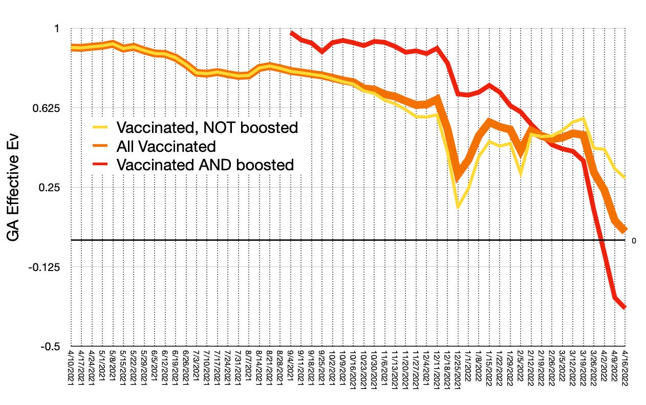
So this is interesting now — yellow (unboosted) tracks orange, since thats all there is, initially up to the fall, and up through the omicron peak itself the boosted component helps pull the overall efficacy up (but was struggling). But everybody meets in Feb. After which it appears the boosted population is now pulling the overall efficacy down. I also wonder if they have some amount of an unknown = unvaccinated thing happening here like we’ve seen in Oregon7
Overall vaccine efficacy now is heading off the cliff, about to hit zero (zero means no benefit, negative means anti-benefit). Boosted people in Georgia seem to since April be more likely to test positive for covid than unboosted or even unvaccinated (above is all relative to the unvaccinated population). Huh. Boosted efficacy started going negative in the beginning of April. Isn’t it so unfortunate Missouri decided to stop publishing their breakthrough data at the beginning of April to miss this?
To complete the set with respect to what I have in the Utah post, lets look at the vaccinated internal booster efficacy:
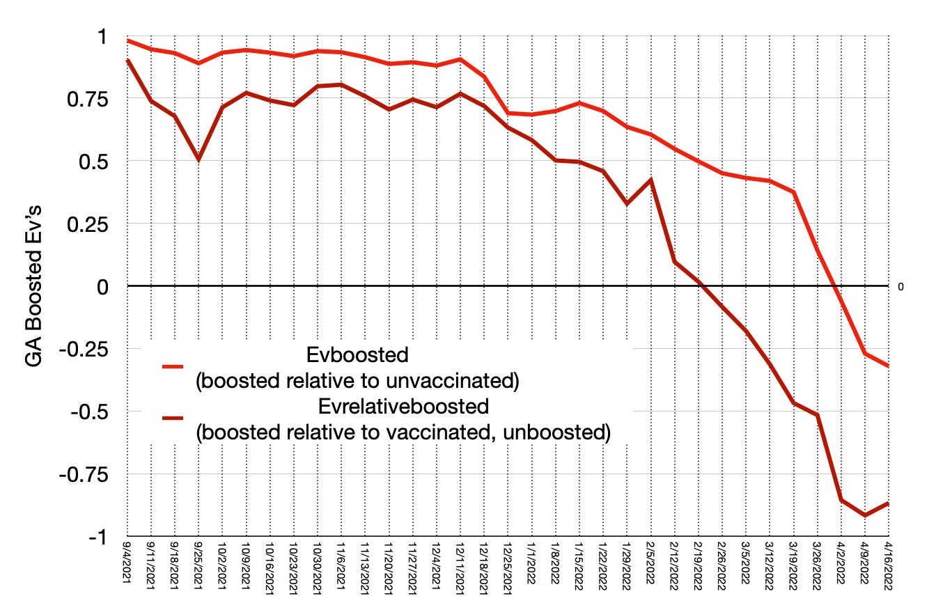
Oh. I just realized I forgot to display the efficacies as percentages… Sorry — will be lazy and leave that conversion as an exercise to the student…
Anyway here we’re now only looking at the efficacy of boosters — the red being the same as above, boosted relative to the unvaccinated population. So that tells you the efficacy of the combination of being fully vaccinated and boosted. The dark “blood clot” red curve though, is boosted + fully vaccinated relative to the unboosted fully vaccinated population. So this should give you some idea of the efficacy of the boosters themselves. Not a very pretty picture. Post omicron they’re clearly not helping anybody. I should say here also the case statistics are about an order of magnitude higher than we have so far in Utah. This negative booster efficacy business might actually be a thing.
Wow. If only somebody could have seen this coming!

https://web.archive.org/web/*/https://health.mo.gov/living/healthcondiseases/communicable/novel-coronavirus/data/public-health/health-metrics/breakthrough-cases.php
https://breakthroughreports.s3.amazonaws.com/Breakthrough+Report_220419.html#counts
And confirmed this by adding up a few points and comparing to their totals for those weeks. I should have done this check for my prior post!