

Armchair Quarterbacking Utah's Rebound
Armchair Quarterbacking Utah's Rebound
We see covid vaccine efficacy drop then mysteriously rebound in Utah

I spent some time this week touring the US for covid breakthrough case data. Many people tour the country for various landmarks, good food, etc. I find I am in a place where I’m tooling around, looking for data related to people getting sick. If nothing else, one doesn’t necessarily have to board a plane for this, and to some extent it can be accomplished with beer and good music in the background. Non-celebratory music that is — we are still looking at numbers of people getting sick or worse after all.
So then its logical, beer in hand, we end up in Utah. Turns out they have a really nice day by day plot of covid-19 cases differentiated between fully vaccinated and unvaccinated individuals. It looks like this1:

Orange is unvaccinated cases, green is vaccinated cases. As we’ve seen elsewhere, there is an increasing number of cases among vaccinated people. By the way it is clear that at the moment the vaccines do appear to be useful, in that there certainly are more infections among the orange. If you’re looking for short term gain, get the shot(s). You probably could be fine.
So for me, given this nice looking data, the next thing to try and do here is to pull it down and plot some things, particularly along the lines of what I’ve played around with before2. I’d like to plot some kind of vaccine “efficacy” over time. BTW, even though Utah has this nice data out there for us, it doesn’t have it in a nice happy computer digestible form that I can find, so I needed to do a bunch of mouse hovering and typing. See above comments about beer and music. OK — back to the fun. Recall:
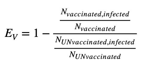
I then suck in all the numbers from the above orange and green plot into a spreadsheet, and calculate this for each day. Below is what I end up from May 1 until now:

So this is interesting — what we end up with is a time series plot of a “live” vaccine efficacy in Utah. It partially unsurprising. We start somewhere near the advertised efficacies earlier in May, when covid variants probably more like what the vaccines were tested on dominated. As the summer has progressed though, the brutal Delta variant has taken over, and at the same time vaccine efficacies have dropped. That this bottoms out in the 70% range is consistent with what we’ve seen elsewhere. So far I still think we’re in a place where vaccines are 70%-ish effective. But lets keep wandering here…
Weirdly, after hitting 70% it rebounds — coming back up in the last few weeks. Why would that ever happen? Are the vaccines somehow becoming more effective all of a sudden? Are Utahns (this seems to be what they call themselves) getting access to a 3rd jab maybe and beefing up their immunity? What is going on here?
This seems to be a good time to emphasize a flaw in what we are doing here, and a flaw, trying to measure this sort of thing with uncaged real live random people doing random people-y things, is always going to have. Underlying the equation above is an assumption that the only thing really different between the two populations of people is the fact that they are vaccinated or not. Inherent in this is the assumption that either population is being exposed to covid in the same way. This may or may not be the case. In fact the plot below, leads me to thinking it is not the case:

The plot is of essentially the two pieces of the fraction making up EV. I’m doing some funny business though — I’m plotting this the way that I see these things mostly end up being plotted, normalized to 100,000 people (think of it like a percent, but instead of multiplying by 100, you multiply by 100,000). The green is the upper ratio (vaccinated) in the EV fraction multiplied by 100,000, the blue is the lower ratio (unvaccinated), also multiplied by 100,000.
I should probably have added together each week here, since you now mainly see what happens when people take the weekends off. Lets mush that together:

Alright — this is a running 7 day average of the plot above — so this should blur out the weekends. Here you see the trends more clearly — blue is as before, unvaxed, green vaxed. These are scaled within the day by day vaccinated or unvaccinated populations, but then again each normalized to 100,000 people. Blue is taking off like there’s no tomorrow, green rolling back down in September. The vaccinated population appears to be behaving differently from the unvaccinated.
What if there was some sudden push in Utah to get vaccinated? Both the green and blue curves would depend on the ratio of people vaccinated there over time. If suddenly over the last few weeks more people became vaccinated, that would take people from the denominator of the blue, inflating that ratio, and add them to the green, reducing that ratio. Let’s look at the vaccinated populations over time. These are the denominators in each fraction making up EV:

So here we’re seeing the two lines approach each other, Utah is nearly reaching 50% vaccination. But one thing I don’t see here is a significant jump in either direction in the last few weeks. The curves are quite gradual over time. I don’t see here that the populations are changing radically to explain the big shift in the last ~2 weeks.
What if we’re seeing a group of people getting a “booster” shot, improving their immunity over the last month? Unless we’re dealing with some ultra secret conspiracy, we ought to be able to see some increase in vaccinations that relate to this. The plot above is of fully vaccinated people, but what does “vaccination doses” look like3?

The “Administered” line here does not show a bump up in the last couple weeks, that I’d expect for an additional shot. Unless a 3rd dose is completely un-monitored, this explanation is not looking likely. Interestingly, “Delivered” does seem to jump up, but it’s probably unlikely the delivery of vaccines that are not yet administered should have an effect. If so though, this possibly is a way around severe reactions. “Just put this vial in your pocket, don’t worry about any actual shots”.
What are other changes in the last few weeks that could have something to do with this? School has started by now in Utah, in most places toward the end of August. What would that do? In general kids in school are going to be unvaccinated, though there is the push to vaccinate them. (What we see below by the way should not be taken as an argument to vaccinate schoolkids — as we’re not considering in any way the risk/benefit to them of vaccination for one thing.) This could have an effect on my EV plot in the direction we’re looking for, increasing the infection rate for the unvaccinated population, but not necessarily in the vaccinated population. We should then see a large increase in cases for school age kids.
Here Utah also comes through for us — from their school monitoring dashboard4:

Despite the label, this clearly isn’t a percent, but is more likely a case count of school aged children in Utah over time. The two different colors are whether the cases were associated with a school or not. Logically you should see the blue (school associated) disappear during the summer (and you do in the summers of 2020 and 2021 here).
So here, what I think we are seeing is the addition of a new component to the unvaccinated population and cases in the last few weeks that the vaccinated population would not have. That would pull the unvaccinated rate fraction up, bringing EV higher. We can try something to see if that blue bump is enough to explain the rebound — what if we subtracted those cases out of the unvaccinated numbers and see what a “hacked” EV would look like — its not saying including them is wrong, but getting an idea of the scale to see if something along those lines could explain the rebound:

So there’s still a rebound, and it probably over-shoots on the low end too a bit due to the crude way I hacked that in, but an increase due to school aged unvaccinated kids going back to school might be enough to explain some of the rebound. Note the end of the graph is missing school data, so my hackery really doesn’t happen for the last week in the plot. Probably a nicer way to see this is to be able break out the breakthrough data by age group, but given the paucity of breakthrough data in general, attempting surgery with axes and sledgehammers is sorta where we are at.
So. OK — unvaccinated kids coming back to school (unfortunately also unmasked5) could maybe be part of the explanation of our rebound, but if we look at just the vaccinated case rates, those are also going down on their own — which is also in a direction that supports the EV curve rebound. What if the green, vaccinated, people are also masking up, where the blue folks are stubbornly not? (This is a guess — based on the subjective observation that in the US people protesting vaccination often are also protesting masks). What does the mask usage look like? From IHME6:

This is some estimate of how much of the population of Utah is wearing masks over time. So here we see the precipitous drop following the spring claims that vaccination will free us all from the evils of masks7. It is pretty clear that Utahns, vaccinated and not ditched the masks almost completely this summer.
We also though do see a small increase in masking in the last month. We’re seeing a doubling of mask adoption from the bottom of the curve, though still small. If we say though that was all among the vaccinated population (a possibly likely connection, but otherwise complete guess) then we’re talking mask use going from 20 to 40% among the vaccinated during the last month. Since they would be ~half the overall population, the change in this plot from everyone would be doubled if exclusively from within the vaccinated population. That could be an upper bound, there’s a lot of supposition here — Utah does not really have a clear mask mandate in the works, in fact perhaps opposite. The timing though looks about right, increasing starting the end of August, and the time we’re interested in is from then to now. To really check this you would need some data tying mask use to vaccination status among the people of Utah.
Alright — substack is grumping at me that I’m again approaching a post length limit, so I should try to wrap this up. I think we see some interesting but admittedly concerning trend data from Utah that aligns mostly with what we’ve pieced together elsewhere. I think we’re sitting at vaccines being in the 70% effective range still, but the trend data has this surprising rebound in the last few weeks. I can maybe convince myself by eye that the EV curve flattens out through July and August. I could also still fit a downward trending line, or there could be some source of recovery I haven’t thought of here. I was hoping with this data to be able to get an idea of if the decline in effectiveness we see is due to the new Delta variant (flattens out when it saturates variant space) or if its due to vaccine immunity decay (continues to fall over time as vaccinations age). The rebound was an interesting surprise.
The rebound I think illustrates the weakness of assuming the populations in both of the very diverse halves in this fraction behave equivalently. (And this behavior difference by the way is part of the reason why vaccine effectiveness studies don’t let the participants know if they are vaccinated or not. That lack of knowledge does not necessarily mean they do behave equivalently though.)
I think, but have not proven, that there are effects that could push my EV curve upward recently — largely unvaccinated, unmasked kids coming back to school, and masking otherwise slightly going up, maybe preferentially in the vaccinated population, could make it look like vaccines were becoming more effective. Not having open data that allows us to investigate these correlations is unfortunate. It is in fact probably dangerous. It continues to blind us to understanding the actual efficacy of vaccination, and that lack of knowledge potentially leaves an increasing fraction of the population vulnerable and unprepared for future variants that may be better equipped to evade the moderate protections they currently enjoy.
https://coronavirus-dashboard.utah.gov/risk.html

https://coronavirus.utah.gov/case-counts/
https://coronavirus.utah.gov/case-counts/ (schools tab)
https://www.kuer.org/politics-government/2021-05-20/utah-schools-barred-from-issuing-masks-mandates-for-upcoming-academic-year
https://covid19.healthdata.org/united-states-of-america/utah?view=infections-testing&tab=trend&test=infections
https://www.whitehouse.gov/briefing-room/speeches-remarks/2021/05/13/remarks-by-president-biden-on-the-covid-19-response-and-the-vaccination-program-3/