

Armchair Quarterbacking Utah's Rebound 2
Armchair Quarterbacking Utah's Rebound 2
Utah is like Mars, but warmer.

Dessicated, any water that might be there highly saline… I still wait for Perseverance1 to round the corner and stumble upon a fragrant lake full of cheerful, round floaty people.
But until then, let’s talk about Utah. Back in September, we looked at the daily covid case numbers posted by the State of Utah for vaccinated and unvaccinated people, and calculated an effective vaccine efficacy for each day. Recall:
We look at this a lot around here to try to gauge the utility of our favorite covid shots. Previously we looked at this in Utah from May-September. We saw this:

The day to day effective Ev slowly wound down over the course of the summer, then mysteriously rebounded. We then engaged in what, in retrospect, probably contains various degrees of disinformation2, trying to come up with an explanation for the behavior. Today we’re going to see if new data updates get any of that towards becoming more like malinformation.
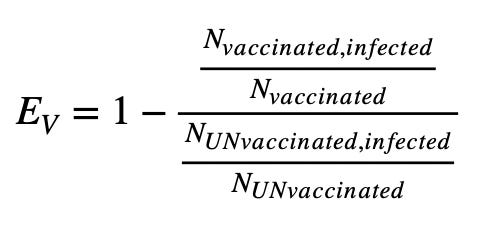
Ev is the thing that the covid vaccine manufacturers report as being around 95% 3. Some rules of thumb for Ev which you can get to by just staring at the equation above:
If no vaccinated people are infected, the top half of the double fraction is zero, making 1-0 = 1 = 100%.
If a vaccine is completely ineffective, the same ratio of people in the top half and bottom half of the fraction are infected, making it approach 1. 1-1 = 0 = 0%
If for some reason the vaccine makes more people get infected, the ratio on the top half of the fraction becomes bigger than the bottom half, 1- (something bigger than 1) < 0. If you hear “negative efficacy” it means vaccinated people are getting screwed. And thats ignoring safety questions…
The plot above starts near the advertised efficacy, but then drops well below that. We suggested in the earlier post that may be due to a degradation in the quality of immunity granted by the shots. We also observed that the delta outbreak, which was widely reported to break past the original Wuhan strain based vaccine immunity, could have something to do with that downturn. Those are things that would inflate the top ratio in the above fraction, bringing Ev downwards. The rebound later we suggested could have been due to (then) unvaccinated school kids starting school, and therefore inflating the bottom half of the fraction. This not being balanced by a similar vaccinated population brings Ev back up again. That then would indicate a flaw in the underlying assumptions in the populations feeding the Ev calculation.
So. It’s been several months and more variants under the bridge. We’ve also looked at several other states4. Let’s revisit Utah data now. And they have been helpfully adding more since we last looked5:

These are daily counts of positive covid cases in Utah for the entire period the vaccines have been deployed. Orange are unvaccinated people, green fully vaccinated. Presumably partially vaccinated people are included in the orange. We see green creeping in in the summer-fall, with a lot this winter. We see the huge rise and fall of the omicron outbreak is half green. Lets pull these numbers out and make our Ev plot again — this time I decided to look at the html and was happily surprised to find the numbers all there, even formatted in a nice helpful list. Should have done that a long time ago. Alright — drop those in and turn the crank:
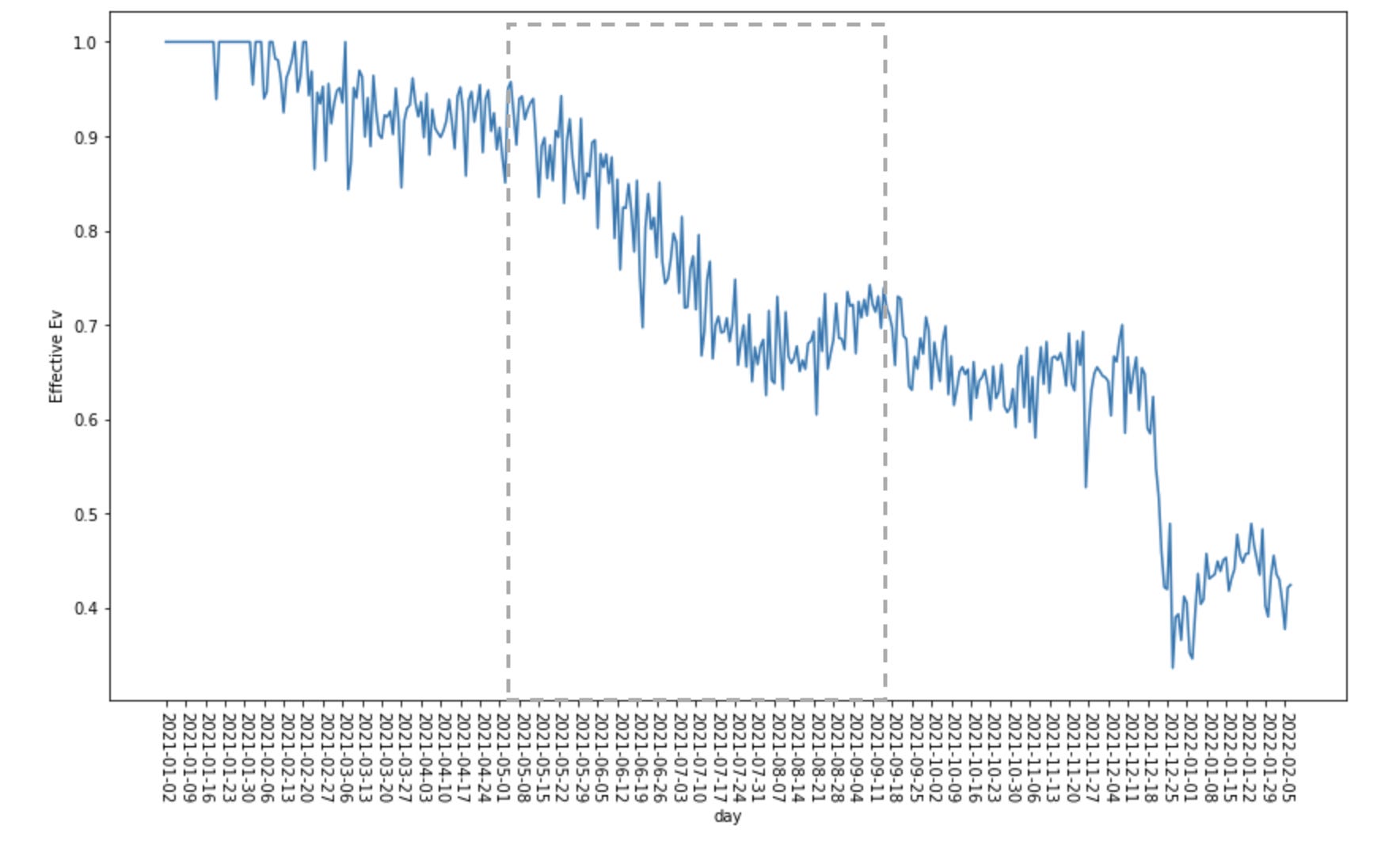
So here I’ve drawn a dotted rectangle around the area that the original plot up top covers. Within the rectangle we see a difference now, particularly on the right-hand side. As we move from right to left, in May we’re sitting around 90%, then decline through July to just below 70%. This looks consistent with the earlier version. The rebound though now is there, but much smaller. Comparing the numbers that made each plot, vaccinated case counts have become larger, unvaccinated cases smaller. The sum each day appears to be close to the same in both datasets. So many cases labeled as unvaccinated in September are now apparently counted with the vaccinated.
Zooming back out to look through the entire new plot — originally we start at the beginning of 2021 with perfect Ev. There were no vaccinated people then, so there were by definition no cases. Ev=1. As the vaccinated population increased into March, we reached a stable effective efficacy number hovering around 90%. To go further we’ll want to look at the variant counts over time6:

Translating the key a bit:
B.1.351 in light blue in May is beta
B.1.437 in orange through the summer and fall is delta
B.1.1.529 in dark blue on the right is omicron
You can scroll up and down between these, but I think the story is pretty clear with the plots just lined up and laid on top of each other — apologies for the repeat:

I think here we see a good portion of the story then — pretty distinct steps of efficacy with the changes of variants. Sitting around 90% with the early ones, drop to 60-70% with delta, then crash to 40% with omicron. Interestingly, we maybe see the initial drop and recovery with omicron that we’ve suggested might imply a faster infection rate with vaccinated people than unvaccinated7. We will want to look at this again at a later date to see if there is another correction like we saw from the data in September though.
We’re looking here around 40% efficacy with omicron though. And that includes a vaccinated population that at this point is nearly half boosted (darker two lines below)8:
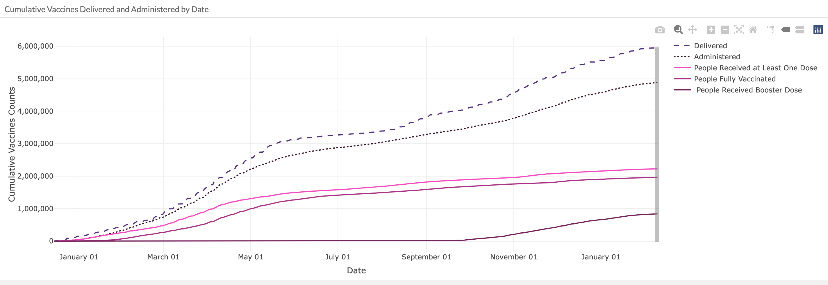
Also look at the ramp up of the bottom-most “boosted” curve with respect to our omicron rebound in January. There is a slight relative ramp up in boosted counts during January, but nowhere near the increase preceding the omicron crash in efficacy. In fact if you look in November, the period with the largest rate of increase in boosted population, Ev does not budge. But then should that be surprising when re-using a vaccine targetting the original strain of covid we’re already losing against with delta?
Patient: “I bruised my forehead running at my front door to get in!”
CDC: “Run at it again. It’ll work this time.”
Getting back to the omicron rebound (though that also seems short lived, coming back down by the end of Jan?). Beyond the infection rate argument we’ve looked at, there is another possible explanation. Vaccinated people donning masks again — this is the mask use plot from IHME9:
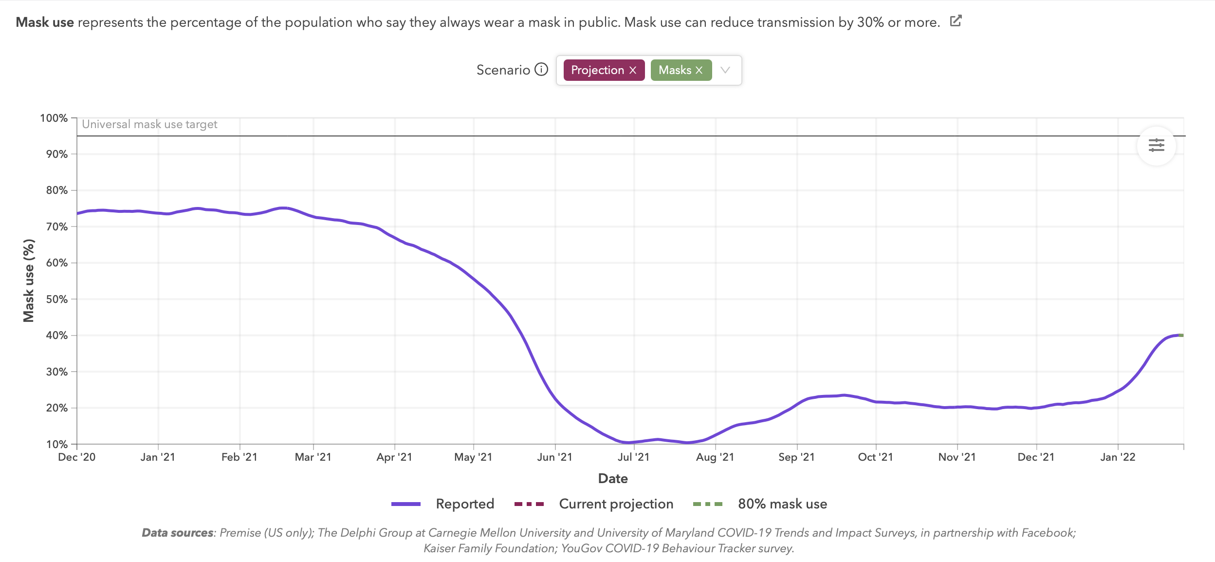
Look at what happens all the way on the right in January. Also look at what happens a bit less in September, when the first, but now less dramatic, Ev rebound is. Could there be another asymmetry between populations at work here?
Ah — I’m seeing my favorite pink substack warning at the top of my browser window again — I’m nearing my email length limit. Time to wrap this up a bit. Where we are at this point then:
Utah. Kinda like Mars, but with Oxygen!
The efficacy rebound we saw in September has degraded, apparently due to an adjustment between vaccinated and unvaccinated categories in the case data.
There is a set of drops in the day to day efficacy corresponding to dominance of each of the main outbreaks: Pre-delta (beta), delta, and omicron
In Utah, vaccine efficacies drop to 60-70% in delta, 40% in omicron.
There’s some smaller rebound features. Could have something to do with relative time dependence in outbreaks/infection rates/masking rates?
So far we mostly have revisited states we’ve looked at before. I’m inclined to say I probably have a mostly consistent picture between Oregon, Georgia and Utah. Alaska is hard to tell, as they age adjusted their data. California also has some ‘splaining to do with their significantly higher than the rest efficacies. Possibly next steps here will be to summarize what these states look like together, then see if we can add anything useful from any other states providing this data…
https://mars.nasa.gov/mars2020/
Adhering to Party newspeak conventions, we will strive to use the definitions of Mis/Dis/Mal-infomation outlined in: https://www.dhs.gov/sites/default/files/publications/digital_media_literacy_0.pdf
https://odysee.com/@BretWeinstein:f/EvoLens115:1
https://www.pfizer.com/news/press-release/press-release-detail/pfizer-and-biontech-conclude-phase-3-study-covid-19-vaccine

https://coronavirus-dashboard.utah.gov/risk.html
https://coronavirus.utah.gov/case-counts/
https://coronavirus.utah.gov/case-counts/ vaccine tab
https://covid19.healthdata.org/united-states-of-america/utah?view=mask-use&tab=trend. (select Utah)