

And Yet There's Oregon 1...
And Yet There's Oregon 1...

(This was not intended to be a two part post. I seem to have hit a substack limit)
So last post I casually looked at breakthrough case numbers in Massachusetts, which seemed to show vaccines were less than ideally effective there in the last two weeks. Oregon makes some nice weekly reports (unfortunately they've had to become weekly, used to be monthly) of breakthrough cases in the state1. A possibly different picture seems to be presented there, from the latest report2:
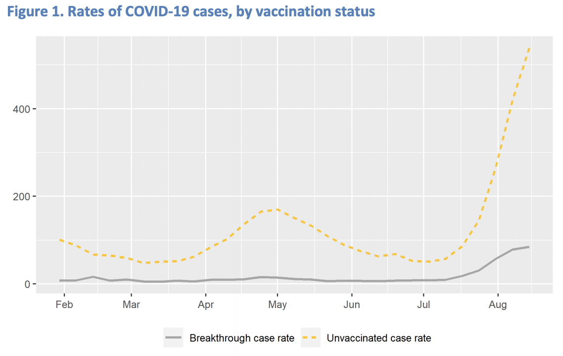
Ignoring the fact there is no labeling of the y axis (or explanation that this is the rate versus what) in the document, this is a nice time series plot. Among other things, it shows cases seem to be dominated by the unwashed… I mean unvaccinated. That the yellow is taking off like an almost unconstrained exponential is troubling. Oregon largely escaped the past outbreaks, and unfortunately is getting hit fairly hard by this current round. Something worth also thinking about is the grey is nearly nonexistent during the May bump, but is readily apparent now.
Even now though, yellow being quite a bit higher than the grey seems to imply vaccines are protecting people somewhat in Oregon. If memory serves it looks like its doing a better job in Oregon than we saw in Massachusetts in the last post here. Clearly if this is the case, I expect the lack of a sales tax in Oregon would have to have something to do with it. But let's look around and see if we can understand if this is different, and try to get an idea what is going on here.
First let's make sure we understand the breakthrough case rate plot above. There is no discussion or labels on the latest week's plot, but there were on earlier reports. On the August 5 version of this3, the y axis is labeled "Cases per 100,000". Further, there is a footnote that says "Denominators for vaccinated population are the cumulative number of Oregonians that were fully vaccinated by week". So to check if we are understanding this correctly, we can see if we can reproduce the last data points on the curve from numbers we know.
The grey curve is labelled "Breakthrough case rate". But according to the earlier note, the breakthrough case numbers should be scaled by the fully vaccinated population. If the orange curve is what we think it is, we will also need to know the population of Oregon4 to also get the unvaccinated population.
So. For a thing thats supposed to encourage writing, substack really seems to be missing a lot of text editing basics, though there’s also some lack of finding one’s ass from elbow on my part here. Tables and equations? Well we forge ahead here with cut & paste images…
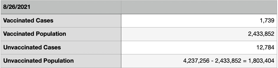
OK, using the numbers in the table above, the August 26 data point should look like

This looks pretty close to the last point on the plot. Good. And for the unvaccinated population it should be

Which... is a ways off the scale of the above plot -- though I would argue that is what would make sense to plot -- the respective rates within each population. What might be the value of the point in the plot, is if you take the Aug 5 footnote literally, and did this:

I.e. dividing the unvaccinated cases ALSO by the vaccinated population. Not sure what that means, and it might be worth checking with the state of Oregon (or maybe PSU?) to see if thats really what they did and intended to do that, especially since they might be dulling their pro-vaccine message.
BUT. We seem to have a different picture here than we saw in Massachusetts5. There appears to be roughly 10x (Using the 708.9 number, since I'm having trouble grasping what normalizing the unvaccinated cases to the vaccinated population means) the case rate occurring in unvaccinated people than vaccinated. Below is a table gathering numbers to compare between this last week in Oregon and the last two data points (Two weeks apart in that case. If only we had a regulatory body to enforce and publicize uniform breakthrough case reporting…) in Massachusetts (see above footnote and above grumble on substack editing, since its not letting me duplicate a footnote).
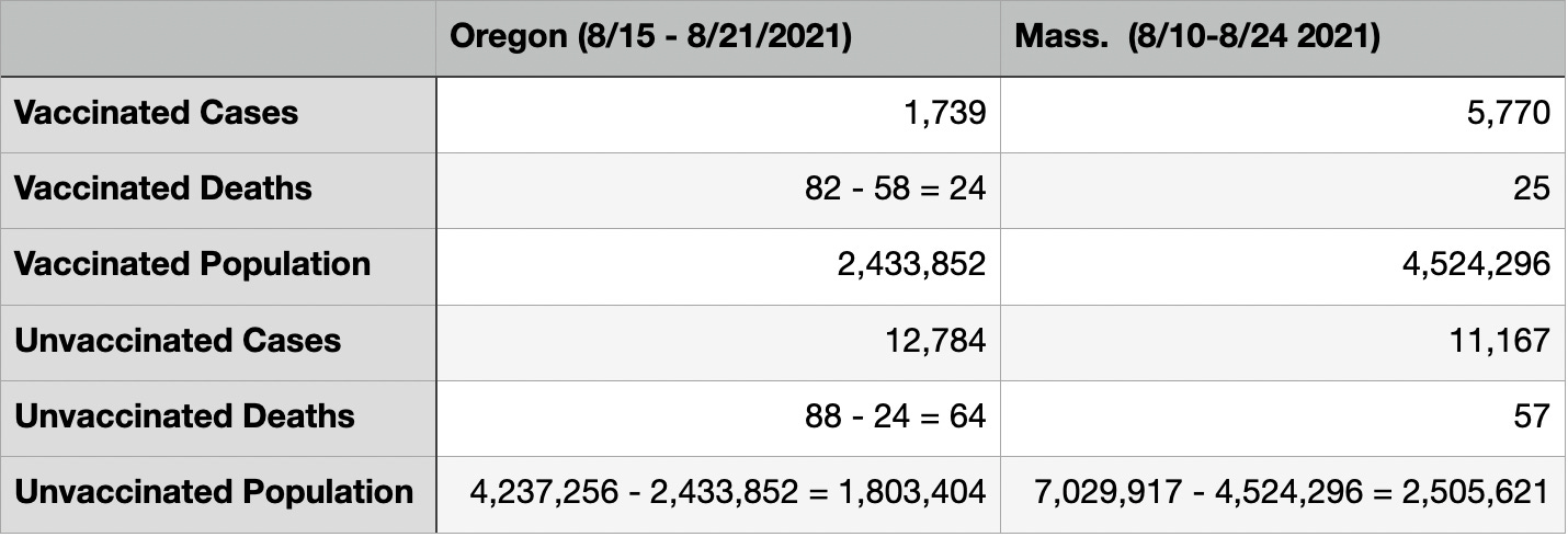
Some subjective observations:
Overall number of cases are similar between the two states, Massachusetts has about twice the population of Oregon, but in two weeks has a number of cases (vax + unvax) not terribly far from Oregon's 1 week. This says Oregon appears to be going through a tougher outbreak than MA right now.
The number of vaccinated cases seems to scale by the population and that MA has two weeks worth of data here. So the vaccinated seem to be experiencing a similar scale of outbreak between the two states.
The same number of vaccinated people died from a much smaller vaccinated case size in Oregon. The vaccinated death rate from those who catch covid appears to be worse there.
The death rates within the unvaccinated cases seems to be similar between the two states.
In Part 2 (I actually wrote the two parts as one shot, but substack complained it was too big. I didn’t really think I rambled that much) of this we’ll dig into the numbers a bit more and see if we learn anything from comparing the two states, and look at vaccine efficacies and death rates…
Clearly we’ll find that the vaccines are effective.
In the August 5 report, https://www.oregon.gov/oha/covid19/Documents/DataReports/Breakthrough-Report-08-2021.pdf, it states: "Denominators for vaccinated population are the cumulative number of Oregonians that were fully vaccinated by week" The plot in that report had a y-axis label of "Cases per 100,000".
